Chart - Question Type
Charts or graphs are often used to visually represent data, making documents richer and more engaging while delivering the relevant information very efficiently to the reader. Infiniti provides the charting question type to draw information from a data source and represent it visually in the generated document.
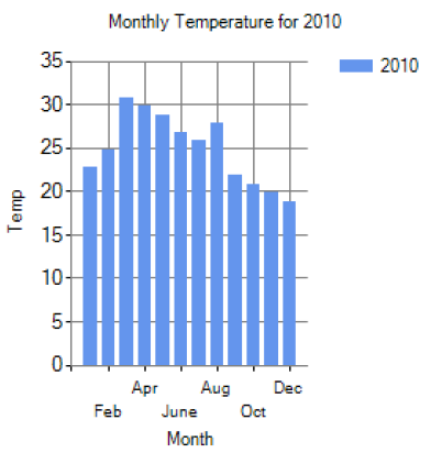
Example Chart
Document Preparation
Before using the charting question, you must prepare the document by adding a placeholder where the chart is to be inserted. Make sure your placeholder is positioned with enough space for the size of the chart, and that the paragraph where the placeholder is positioned has all the appropriate justification and spacing settings.
Usage
The charting question is driven by data, so ensure you have a data source question configured appropriately. This is usually a multi-row data source, and any data to be used in the chart must be first mapped to answers in the data source question. These are used by the chart to specify the series and category values. The selection type attribute in the Data Source Properties should be set as Multiple Rows for the datas to be used in the chart.
How to add a chart question
Question Properties - Chart
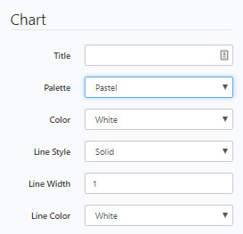
In Question Properties under Chart, set the following properties:
Property | Description / Examples |
|---|---|
Title | Type the chart title, which is to appear above the chart. |
Palette | Select the color palette for a pie chart. In all other chart types, this property has no effect as you must select a palette or fill colour on the series. |
Color | Select the color for the background area around the chart. |
Line Style | Select the line style for the border around the entire chart area. |
Line Width | Select or type the width in pixels for the border. |
Line Color | Select the color for the border. |
Question Properties - Legend
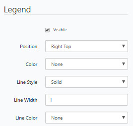
In Question Properties under Legend, set the following properties:
Property | Description / Examples |
|---|---|
Visible | When checked the legend will display, otherwise it will not. |
Position | Select the legend position in the chart area from the drop-down list. |
Color | Select the color for the background of the legend. |
Line Style | Select the line style for the border around the legend. |
Line Width | Select or type the width in pixels for the border. |
Line Color | Select the color for the border. |
Question Properties - Chart Area
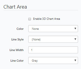
In Question Properties under Chart Area, set the following properties:
Property | Description / Examples |
|---|---|
Enable 3D Chart Area | Turns the chart into a viewable 3D chart |
Color | Select the color for the background of the chart area. |
Line Style | Select the line style for the chart border. |
Line Width | Select or type the width in pixels for the border. |
Line Color | Select the color for the border. |
Question Properties - Value Axis
In Question Properties under Value Axis, set the following properties:
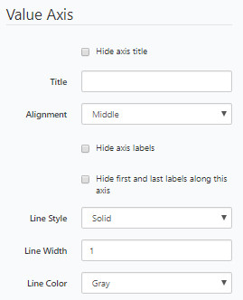
Property | Description / Examples |
|---|---|
Hide axis title | Tick to hide the axis title. |
Title | Type the axis title to be displayed. |
Alignment | Select the alignment of the title, Left, Middle or Right justified to the axis. |
Hide axis labels | Hides all labels along the axis. |
Hide first and last labels along this axis | Hides only the first and last labels of the axis, which can make the chart appear less cluttered while still providing detailed information. |
Line Style | Select the line style for the axis line. |
Line Width | Select or type the line width. |
Line Color | Select the line color. |
Question Properties - Category Axis
In Question Properties under Category Axis, set the following properties:
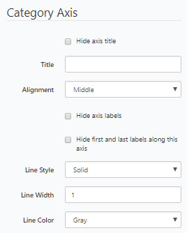
Property | Description / Examples |
|---|---|
Max Height | Set the maximum height of the area for the chart to be placed in the document. |
Max Width | Set the maximum width of the area for the chart to be placed in the document. |
Units | Select the unit of measure for the height and width. |
Multi-Series Chart
The below example shows a chart comparing monthly temperature averages for two different years.
Note:This example assumes that the user has an existing data source set up to filter the chart with the necessary data. In this example, we have used a simple database table that has monthly average temperatures for 2012 and 2013. Then used a multiple row list box data source to pull the data from the database and into Infiniti.
Please refer to the article Chart question type before continuing.
Simple multi-series temperature chart example:
Add a chart question type.
Rename the chart question and answer to a meaningful name e.g. 'Temp Chart'.
Click to select the chart question and navigate to the properties page.
The series window will now display.
Add the following properties and click Add.
Add another series chart by clicking the add button in the series window. Add the following properties and click OK.
Go back to the properties page and scroll down until you find the Value Axis segment
Add the following properties
Scroll down until you find the Category Axis segment and add the following values.
Add a placeholder onto the chart answer.
Run in produce and the chart should insert into the document and look similar to the screenshot below.
Enabling 3D Chart Area##
It is now possible to enable your chart to be in 3D.
Click to select the chart question.
Scroll down to the Chart Area segment in properties
Check the Enable 3D Chart Area checkbox and click OK.
Run in produce, the outputted chart should look similar to the below screenshot.
Updated 12 months ago
