Question Design - FAQ
How to make dates un-selectable?
When a date is filtered out it will appear grey and if entire years or months are filtered out, they will no longer be selectable.
There are many ways to create our grey dates.
You may have noticed at the bottom of the question properties tab, there is a checkbox called Weekdays Only. If you select it will make every day under Saturday or Sunday unselectable.
You may also want to make a range of dates unselectable. Click on the validation tab and change the Comparison type to Less Than. Type in the date you want to set as the minimum and click add.
Change the comparison type to Greater Than and type in the date you want to set as the maximum and click add. It should look something like this.
NoteCurrently making dates un-selectable can only work for: Greater Than, Greater Than or Equals, Less Than and Less Than or Equals types of validation.
The validation on making these dates un-selectable is done upon the page loading. So, if you have the minimum and maximum dates being previous questions of the same page you will only be able to have those dates greyed out after you go to a new page. The normal validation still applies.
Adding images to question text
Images located on the internet or network can be added to question text by clicking on Source code using the <IMG> tag as in the example below.
Question Text:
Answer the question below.
Images can be combined with document sections, columns and labels to create much richer screens as shown in the screenshots below.
Adding images to questions
Images located on the internet or network can be added to question text by clicking on source code using the <IMG> tag as in the example below.
Question Text:
Answer the question below.
Images can be combined with document sections, columns and labels to create much richer screens as shown in the screenshots below.
How to control the size of an uploaded image
Infiniti allows users to specify the size of an uploaded image that is to be inserted into a document. This image size can be defined by a range of measurement units, such as pixels, inches, points, etc.
Image size can be configured via the ‘Properties’ tab of an image that has been mapped to the 'Answer' of a 'Content Library' question.
See the screenshot below:
The attributes that help to specify the size of an uploaded image are described in the table below.
Property | Description/Examples |
|---|---|
Max Height | The value assigned to this property is the maximum height. |
Max Width | The value assigned to this property is the maximum width. |
Units | This property provides a range of units. |
Stretch to Fit | Selecting the ‘Stretch to Fit’ checkbox stretches the image to fit the max height and max width value.
However, If ‘Max Height’ and ‘Max Width’ values are less than the original size of the image, the resulting image will accept the given size dimensions, even if the stretch to fit checkbox is not ticked. Thus the resulting image size will get reduced from its original size. |
Alternative Text | The value provided to this property will appear as an alternative text in the generated document. |
Also, users can retrieve upload file name using '[q1.Filename]' syntax. where '[q1]' is the name of content library question. '[q1.Filename]' syntax will return the name of the uploaded content file on evaluation.
Bullet Points
Bullet points can be added to question text using HTML, for example:
- Point 1
- Point 2
- Point 3
resolves to the screen below in Produce.
Customizing question text position
Each Visible question type has a Text Position Drop down field allowing you to customize the look of your question when it is published in Producer. The question text property can have the same or different values creating a variety of on-screen layout effects. The screenshot below shows an example of each of these values for a Text Field, Label, and Multiple Choice Question.
Property | Description |
|---|---|
Top | Displays the question text above the response area and stretches the entire screen or column. |
Left | Displays the question text to the left of the response area, often the question text ends with a colon, |
None | No question text is displayed. Useful for label questions that link to images and questions within repeating sections where the column heading acts as the question text, as depicted below |
Question Comments Option
Activating Question Comments
The Question Comments feature can be activated by checking the Allow Comments option at the bottom of the Properties section in Web Design for each question you want comments to be allowed for.
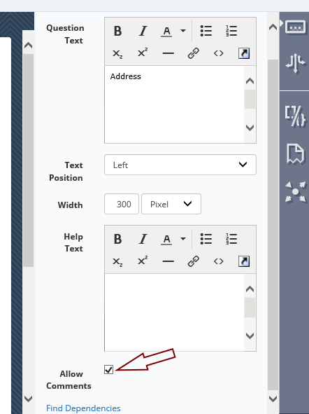
The following types of questions have the Allow Comments option:
- Data Source
- File Selection
- Geolocation
- Ink
- Label
- Multiple Choice
- Numeric
- Password
- Rich Text
- Text Field
Using comments in Produce or the Windows App
A comments icon will appear next to any question in where comments are activated. The icon will be different depending on whether comments already exist for the question or there are no comments yet on the question.
A counter will appear next to the icon to indicate that this question has comments not yet seen by the current user.

Creating a comment
Clicking on the icon will open a popup with any current comments and the option to add new comments.
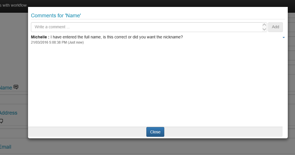
Comments will be marked with the date and time of creation and will appear listed in reverse date order. Comments will be prefixed with the user's name (or username if no name details entered) so you can identify who made a comment.
Once you have added comments you must close the popup before you can continue working with the form.
Can I edit or delete a comment?
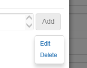
Once added a comment can be deleted or edited only by the current user. A small down arrow will appear at the side of any comment that can be currently edited or deleted. Click on this arrow will bring up the edit options.

Selecting Delete will delete the comment.
Selecting Edit will bring up the edit options. When you edit a comment, the time is updated to indicate the last time the comment was changed.
Once the current user submits the form or submits part of the form, the comments entered by that user can no longer be edited or deleted, even if that user returns to the same question in a later step of the form.
NoteFor mobile versions there will be an edit pencil and a delete "X".

Can I view the comments after the form is completed?
Comments are not normally saved to any answer file that is created (see here if you need to save comments in answer files), they are however if you have the history activated, the comments are kept along with the form answer history.
What if the question is not editable?
Comments are still able to be added and read for questions set to be not editable.
What about parallel workflows?
Comments will be merged during parallel workflows. Users will be able to see any comments saved as part of a parallel workflow, up to the point they started working on the form. If they save their answers and come back later, they may see additional comments added by parallel users.
Default value for a question reference
When referencing the value of a question in a formula, a default value can be set. The reference will return this value instead if the referenced question is blank/null.
For instance, a question reference of the format:
[q1|No answer provided]
will return "No answer provided" when q1 is blank, and the content of q1 when it is not blank.
This can be used to cleanly default to a value, without needing an intermediate calculation in a Label or Variable question.
Question References Explained
As the different question types have different behaviors, references to them within formulas can have slightly different syntax.
If you are unsure the reference tool (the shortcut arrow beside the formula filed) can be used to create a reference automatically with a point and click motion.
The following table explains how to reference each question type:
Question References Explained | Syntax |
|---|---|
Text Field | Question ID enclosed in square brackets, e.g.: [Q2] |
Variable, Address Prompt | Question ID enclosed in square brackets, followed by a decimal point (.) and the answer ID or name, e.g.: [Q3.3] |
Data Source | Question ID enclosed in square brackets, followed by a decimal point (.) and the data field name, answer ID or answer name, e.g.: [Q3.Surname] |
Multiple Choice | Question ID enclosed in square brackets will return the value property of the selected answer e.g.: [Q4] To always reference a particular answer include a decimal place followed by the answer‟s ID or name, e.g.: [Q3.3] |
Auto Logic | Question ID enclosed in square brackets, followed by a decimal point (.) and the answer ID or name will return a 1 or 0 after processing the Rules of the answer. e.g.: [Q7.14] |
Right aligned text
Right aligned text can be achieved by using the float:right; CSS property as part of your question text. As per the following tag.
<span style="float:right;">Final Value</span>Saving Question Comments to Answer Files
It is possible to keep comments in a saved answer file. However, there are a few potential drawbacks.
1.When the answer file is loaded it may contain comments from persons no longer employed or working with this project which might cause confusion.
2.Every comment will be reset as not seen by any user, this means any question with a comment saved in the answer file will show a counter indicating a number of unread comments - however, the current user may have seen these comments in a previous run of this project.
If you still want to enable this functionality:
A flag called ENABLE_COMMENTS_PURGE can be set to the appropriate business unit in the Global_Options table.
insert into [Global_Options] (businessunitguid,optioncode,optiondescription,optionvalue) values ('<Insert your business guid here>','ENABLE_COMMENTS_PURGE','Enforce purge of comments at finish if not archived','True')If this flag is set to True, then pinning of comments is activated. A pin-style icon will appear next to each comment, and clicking on it will unpin/pin the comment.
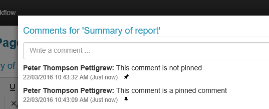
New comments are automatically pinned.
Comments can be pinned/unpinned by any user at any workflow stage.
What happens to pinned comments?
- Pinned comments will be kept in the template and workflow history logs once the workflow is complete.
- Pinned comments will be saved to any answer file created,
What happens to unpinned comments?
Unpinned comments will not be saved to any answer file or log file.
Will a reloaded answer file contain comments?
Reloaded answer files (accessed using the reload icon) will NOT include unpinned comments. However pinned comments will be displayed on a reload.
Display Types
Data Grid for Data Sources
Designers can now select a Data Grid display type for a data source. This display type is similar to a search question type with additional options such as pagination, search, sorting and formula display fields where is possible to define a number of rows per page.
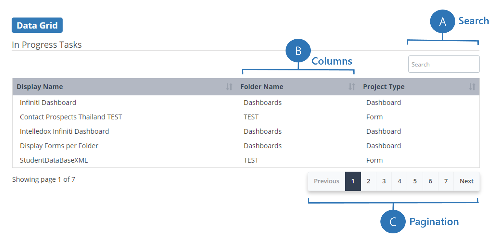
Customization of columns allows defining events, if sortable and display fields (formulas or columns). The data grid is also 'responsive' in that it will push columns into an expandable row if they do not fit on the screen. This display type is excellent to tabulate information and creation of dashboards as it also includes the option of auto refresh, allowing to have real-time data.
Converting currency to text
There is format string on Answer Properties that allows for the conversion of numbers from currency to English text for a range of currencies.
NoteIt is also available in Spanish
cur | Converts a number as currency in text form - uses the default currency set for the system |
cur usd | Converts a number as currency in text form using the specified currency from the currency code supplied |
cur zero usd | Converts a number as currency in cheque text form (ie: zero dollars and cents are specified), a currency code can be supplied after the 'zero', if not the default currency is used |
Notethe + and - format strings can also be provided to control the casing
eg: +cur usd
Currency codes
ARS | AUD | BBD | BIF | BMD |
BND | BRL | BSN | BYN | BZD |
CAD | CDF | CHF | CLP | CNY |
COP | CUC | CUP | DJF | DKK |
DOP | EGP | EUR | FJD | FKP |
GBP | GGP | GIP | GNF | GYD |
HKD | IDR | IMP | INR | JEP |
JMD | JPY | KMF | KPW | KRW |
KYD | LBP | LKR | LRD | MUR |
MXN | MYR | NAD | NOK | NPR |
NZD | PHP | PKR | RUB | TWF |
SAR | SBD | SCR | SDG | SEK |
SGD | SHP | SRD | SYP | THB |
TTD | TVD | TWD | USD | UYU |
VND | XAF | XCD | XOF | XPF |
ZAR | ZWD |
Decimal place validation
If you need your form project to capture numbers that must have a specific number of decimal places, you can add Regular Expression validation in Design. The following regular expressions will validate to the noted number of decimal places:
1 \d+(.\d{1,1})?
2 \d+(.\d{1,2})?
3 \d+(.\d{1,3})?
4 \d+(.\d{1,4})?
5 \d+(.\d{1,5})?
6 \d+(.\d{1,6})?
HTML – Suggestions for text inserts in Infiniti
While a general discussion on HTML and its use and configuration is out of scope in this instance, this article is meant to list some ways around a few common issues that may be encountered while doing HTML inserts in Infiniti. In Infiniti, there are several instances in which HTML can be used as a default and/or input value for settings like “Default text values”, “Rich text inserts”, etc.
This article lists out some subtleties to be taken into account when using “HTML” input.
Bullets
Bullets can be inserted as part of an HTML-insert by using either of the following “ordered list” attribute suggestions within the body of the relevant HTML block:
<ol>Type<ol>List-Style-Type
Using the <ol> Type attribute
The <ol> Type attribute uses the following settings to determine how bullets will appear HTML text being inserted (Ex: into a rich-Text box). This method is NOT recommended as the Rich Text Box does not support the accurate display of all the options below – leading to some being displayed as standard bullets when roman-numerals are expected.
Value | Description |
|---|---|
1 | Default. Decimal numbers (1, 2, 3, 4) |
a | Alphabetically ordered list, lowercase (a, b, c, d) |
A | Alphabetically ordered list, uppercase (A, B, C, D) |
i | Roman numbers, lowercase (i, ii, iii, iv) |
I | Roman numbers, uppercase (I, II, III, IV) |
Example of “Decimals” bullets:
<p>Where are bullets most often used?</p>
<ol TYPE="1">
<li>Technical writing</li>
<li>Reference works</li>
<li>Notes</li>
<li>Presentations</li>
</ol>
Generated result:
Where are bullets most often used?
- Technical writing
- Reference works
- Notes
- Presentations
Using the <ol> List-Style-Type attribute
The list-style-type command allows you to set the entire list, or just one element, to a specific type. This offers more leeway than the <ol> Type attribute. The following options are available for use with the List-Style-Type attribute:
Value | Description |
|---|---|
circle | circular bullet |
square | solid-square bullet |
disc | solid-circular bullet |
decimal | basic 1, 2, 3, counting |
lower-alpha | lowercase letters (a,b,c,) |
upper-alpha | uppercase letters (A, B, C,) |
lower-roman | lowercase Roman numerals (i, ii, iii,) |
upper-roman | uppercase Roman numerals (I, II, III,) |
Example for “Upper case Roman numeral” bullets:
<p>Where are bullets most often used?</p>
<ol style="list-style-type: upper-roman">
<li>Technical writing</li>
<li>Reference works</li>
<li>Notes</li>
<li>Presentations</li>
</ol>
Generated result:
Where are bullets most often used?
I. Technical writing
II. Reference works
III. Notes
IV. Presentations
Adding a date to filename
Often it is appropriate to ‘Time Stamp’ a document by putting the date or time in the filename. This can be achieved with a formula. Note: filenames cannot contain characters such as backslashes so the hyphen ‘-’ character is often useful.
Use a formula similar to the following example in the set filename dialog box, Actions > Set File Name
concat([q1], " ", format(today(),"dd-MM-yyyy"))Document format strings (text)
Format Strings | Effect |
|---|---|
Displays all text in upper case | |
Displays all text in lower case | |
+- | Displays the first letter of text in upper case, with the rest in lower case |
one | Displays the number as text rather than a figure, for example, 100 would display as “One Hundred”. |
+one | Displays a figure as uppercase text |
-one | Displays a figure as lower case text |
+-one | Displays a text figure that starts with a capital letter with the rest in lower case. |
+-+- | Displays all text in Title Case where the first character of each word is capital and the rest is lower case(Useful for formatting external data that can come in as all upper case). |
Style Attributes

Placeholder behavior on Multiple Choice and Auto Logic
For Placeholders used on the Answers of Multiple Choice and Auto Logic Questions, there are a number of different options for how the Placeholder will behave.
Multiple Choice
Auto Logic
Behaviors
Content Preserve/Remove (Multiple Choice & Auto Logic)

The placeholder is retained or removed from the document based on answer selection. This is the default behavior.
Apply Style (Multiple Choice & Auto Logic)
Applies a Word style on the text within the placeholder. The style options are the custom styles defined in the Word template for the project.
Insert Answer Value (Multiple Choice Only)
This option inserts the text contained within the “value” field. In the example below, the value field is set to “Short term”. When the project is generated, if this option is selected, then the placeholder will insert “Short term” into the generated document.
Insert Display Text (Multiple Choice Only)
This option inserts the text contained within the “Display text” field. In the example below, the Display Text is set to “Short term duration”. When the project is generated, if this option is selected, then the placeholder will insert “Short term duration” into the generated document.
Insert Checkbox (Multiple Choice & Auto Logic)
Inserts a checked or unchecked box character depending on answer selection. If the answer is not selected, a blank check box will be inserted. If the answer is selected, a “ticked” checkbox will be inserted.
Question Text Formatting Using the SPAN Tag
Some text elements within Producer can be formatted and controlled using HTML in Design These elements include:
- Question Text
- Section Descriptions
- Label Text
Probably the most powerful HTML tag to format text is the SPAN tag allowing you to specify properties such as color, size, font, style etc.
SPAN tags are of the look like the following where the properties are specified within the style attribute of the tag:
<span style="font-style:italic;font-weight:lighter;font-size:large;">YOUR TEXT HERE</Span>The style attribute is a little sensitive. The property names and values are separated by a colon and each property is separated with a semicolon (no spaces).
There are many useful properties, but some common ones are listed below:
- border
- color
- font-family
- font-size
- font-style
- font-weight
- padding
Adding Javascript to Questions
Infiniti deliberately acts to keep both user and the host safe from malicious code. All text entered into questions will be sanitised any potentially vulnerable or malicious scripts from being executed. This means javascript cannot be run from question text.
Infiniti will only allow code to be executed from trusted sources, but this doesn't mean you can't execute your own code. There are 3 options: you can inject via the Skin file, a State Provider or a Custom Question.
Which method you use depends on what you need to do:
- A Skin file is mostly used for injecting behaviour aspects into your form or theme, i.e: tooltips
doc:themes-and-skinning-overview - A Custom Question can be used if you need to capture an input to reference within the form
doc:custom-questions - A State Provider can be used to as a method to hijack certain functionality within the form and apply it to all forms eg: auto triggering save.
doc:state
Updated about 1 year ago
