Data
Overview
The Data question makes requests to external systems and data stores. The yielded results are displayed via controls such as a drop down menus, tables and/or as content within generated word or PDF documents.
Actual Connections to external systems are configured in Manage and are different depending on the targeted technology of the source. However, once a connection is established, the configuration of the actual data question is common. For more information about data connections, refer to this page.
Often, the data question is configured in a way that does not require interaction from the user. For example, querying an HR system for the current user’s position and address and then display it on the screen.
Data Question Properties
On top of the normal question properties (question text, mandatory etc.), data questions require extra configuration to ensure the requests and results are made and displayed as intended. Each is described in the sections that follow.
Property | Description / Examples |
|---|---|
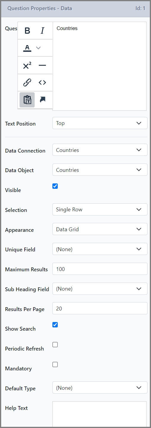
Data Connection | The external system that the question should target. This should be configured in Manage. |
Data Object | The particular entity or records that the question should target. Each Data Connection has one or more Data Objects that are configured in Manage. |
Selection | Determines whether a single or multiple record/rows are to be selected from the dataset returned by the connection. |
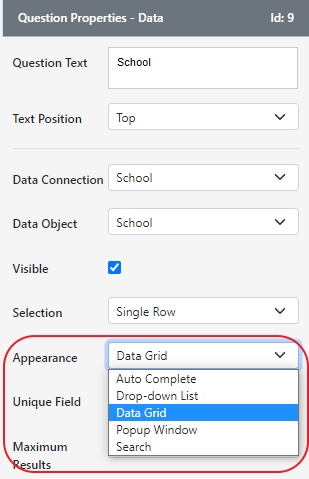
Appearance | How the returned data set is displayed within a form. The appropriate option is dependent on the data being returned and the selection type.
Some display types require extra configuration. See Display Types for more information. |
Display Field | For display types that show a single column of data, namely Auto complete, Drop-down list or Popup window, defines which field to actually display in the control. Note:For display types that show several columns The Display Fields panel is available for more finite configuration of each column. For more information, refer to Display Field/s. |
Unique Field | Unique fields ensure that selected record(s) remain true between workflow steps and saves even though the returned data sets might change. Choose a field/column that uniquely identifies each record. For example a “ClientId” might be a unique field for each client whereas Surname or DOB is likely not unique. This concept is often referred to as a primary key. Without a unique field, SmartIQ will remember the index of the selected row. However, if the data set changes between saves or workflow steps, the record at index “x” might differ. |
Maximum Results | Restricts the number of rows available in the results. The default value is 100 while existing questions remain blank or unrestricted. Cloud environments are deployed with a default of 1000 records. |
Default Type | Which record to pick by default when the form is first loaded. The options are:
|
Allow Data Upload | For use cases where the user can provide their own data (for example a CSV or XML file). |
Display Types
There are different types of displays or appearance that can be configured for each question.
- Auto Complete (Single Selection Only) – Displays the word or phrase a user is currently typing and provides a list of suggestions that the user can select from.
- Drop-down List – Provides a list that a user can select from. The options are typically displayed as a list that appears in a box below or above the element that was clicked on to activate the menu.
- List Box (Multiple Rows Only) – Shows the various data connection entries as checkboxes inside a box.
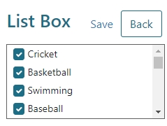
Default Select AllThe List Box, Popup Window and Search options automatically selects all fields. Select either
Default Index = 0orDefault Value = Noneto clear all checkboxes by default.
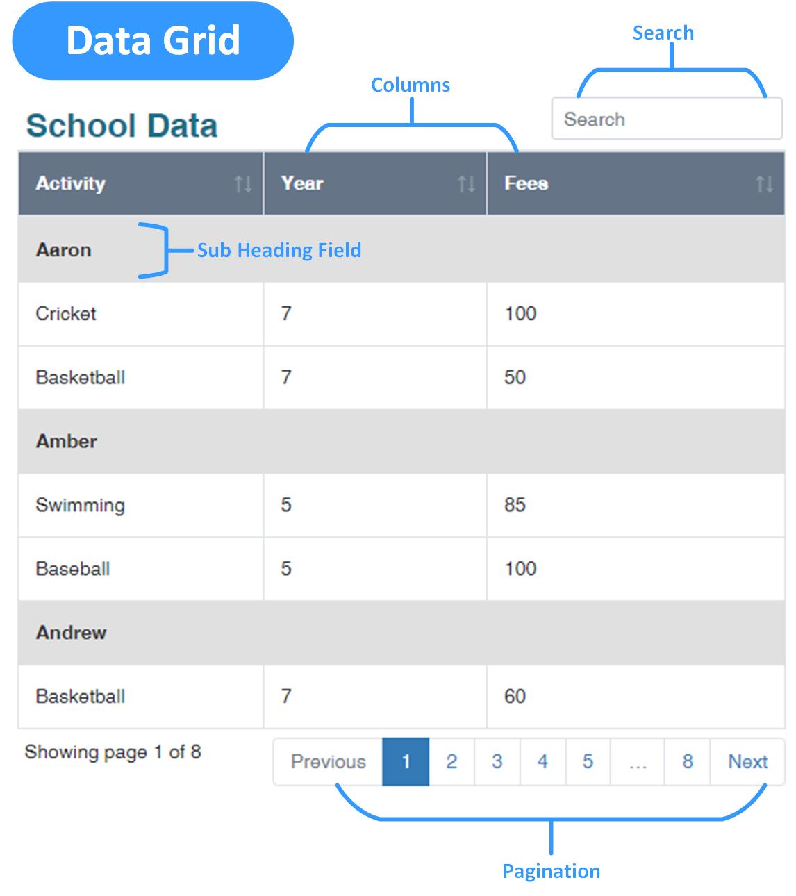
- Data Grid – Presents a search interface for use within smaller question areas such as columns. This will open up a new field called Sub Heading Field, which groups the rows and creates a secondary heading based on the selected field.
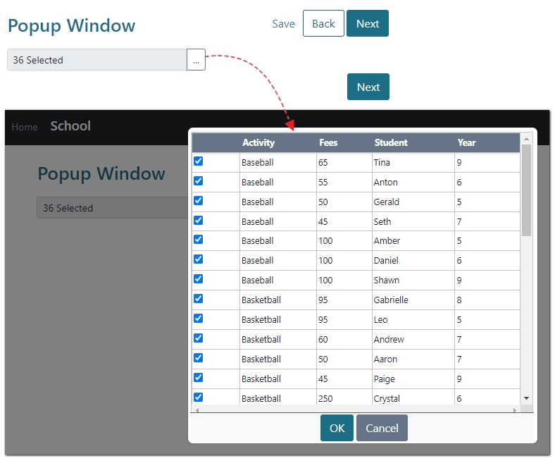
- Pop-up Window – Opens a separate window useful for smaller question areas such as columns. The highlighted or checked item in the list can be selected by pressing Enter or clicking OK. Press Enter or click Cancel without selecting an item to close the popup. Multiple Row data sources can be used in a Repeating Section for this display type.
- Search – Displays a table with a column that either displays the Select keyword option for Single row Selection Types or checkboxes when using the Multiple row Selection Type. This display type also supports the Allow Select All option.
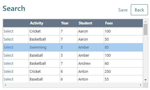
Single Row Selection
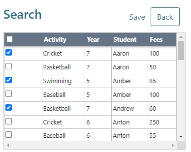
Multiple Row Selection with the Allow Select All checkbox
Auto Complete
Auto Complete display type displays results as the user types and shows results in a drop-down list for selection.
By default, the Auto Complete display type works by filtering a returned dataset to display only the rows that contain the term entered by the user, referred to as the [UserEnteredTerm]. For example, for a dataset containing a list of countries, if the user typed “United”, the results may include United Arab Emirates, United Kingdom, United States.

For data connections whose purpose is to receive partial search terms and return a dataset containing potential results, the Auto Complete display type supports passing the [UserEnteredTerm] to the data connection upon each user keystroke and displaying the result.
For example, if the data connection was an address parsing service and the user typed “12345 George”, SmartIQ would pass the [UserEnteredTerm] to the service and display the entire returned data set for selection. The options might include “12345 George Street” and “12345 Georges Terrace”. For more information, refer to User Entered Data Filters.

Auto Complete has the following additional properties:
Property | Description / Examples |
|---|---|
Watermark | Watermark text that is shown before the user types anything into the field. |
Min Characters | The minimum number of characters that the user types before results start to display. This is a useful feature when using data sources that have large amounts of data to retrieve. |
Min Characters Message | This message will appear below the Auto Complete box if the user has less characters than the minimum character number specified above. |
No Data Text | This is the message that will display if no results are found. For example, “No Results Found For [UserEnteredFilter], try another term” |
Data Grid
The Data Grid display type renders as a table with pagination, sorting, search UI elements.
Data Grids have the following additional properties:
Property | Description / Examples |
|---|---|
Selection = (None) | This behaves like an uneditable data connection where it is not possible to select a row. |
Sub Heading Field | Groups the data in sections based on equal values of the defined field. |
Results Per Page | Determines how many rows will appear on each page of the data grid |
Show Search | Checking this option enables a search text box to appear above the data grid. |
Show Export | Displays an Export button allowing the displayed data to export to an Excel or csv file. |
Allow Select All | Display of Select All and Select None buttons allowing the user to quickly select or deselect all rows. |
Periodic Refresh (Dashboard Only) | Enables the data source to continually update itself |
Refresh Period | The time in minutes before the data source refreshes itself |
Data Filters
Data filters are term(s) passed to the data connection so that appropriate result(s) are returned. For example, when retrieving client details, a “ClientID” filter might be passed to the data connection.

Filters must be configured to match what is expected by the data connection. Filters can be hardwired constant values or be sourced dynamically from previous answers in the question set. In the example below, the result will contain a data set with records with a fee greater than “75”.

Property | Description / Examples |
|---|---|
Filter Field | Filter Field of the data object to pass a value to at runtime. For example, ID, CustomerNumber, TransactionDate etc. |
Comparison | Options are:
|
Type | Options are:
|
Aggregate | This option is available when the parent question is a multi-row Data question. When creating the grouping for an Aggregate filter, positive filter types (such as Equals, or Contains) are wrapped in an Any Of group to avoid the filters excluding matches from other filters in the aggregate. While negative filter types (such as Not Equals, or Not Contains) are wrapped in an All Of group to avoid the filters including records that are excluded by other filters in the aggregate. A filter referencing repeated data without Aggregate would result in a single filter using the pipe-separated data values. |
Example of the data filtered by using a Parent Question.

User Entered Data Filters
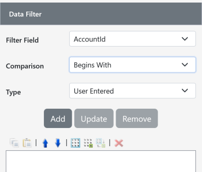
A user entered data filter will send request(s) to the data source as the user types. Thus this filter type is only available to the Auto Complete display type. Typically, this feature accepts partially complete search terms and passes them to the data connection for predicted results. Recommended comparison types for a user entered filter on Auto Complete are Contains or Begins With as these are the types that make sense with partial input.
In the screenshot below, Auto Complete suggests accounts after receiving a partial or full AccountId.
A more common use for Auto complete with user entered data filters are address searches wherein a data source accepts part of an address, searches against what is typed and attempts to match it to a real address. For example, a user might type ‘123 Fake Street’ but select ‘123 Fake Street, Hartford, CT 20600’ as their actual address. In all cases, it is the responsibility of the data connection to process the user entered filter into a real result.
Notes and Best Practices:
- This data filter approach is only appropriate for data connections that expect a partial search term. For example retrieving all the records that contain the character ‘a’
- When you make a selection from a result set, the [userEnteredTerm] typed is saved in the answer file. When the project is saved and resumed at a later date, a subsequent call to the data connection is made again, hopefully returning the same result. However, if for any reason the data connection returns different results, previous selections may be lost.
- In the client app, the question is only enabled in online mode.
How to add a user-entered data filter
Add a data source and configure its properties, specifically specifying ‘Auto Complete’ as the display type and choosing an appropriate data source.
Navigate to the Data Filters tab, the User Entered option will be an available type. Specify the data filter for which the [UserEnteredFilter] should be passed to.

Results Transformation
Results Transformation allows the manipulation of data after it has been returned from the data connection. Transformation may include removing unneeded columns, removing duplicate results (distinct) and aggregate calculations such as Average and Sum. The transformed results are displayed on screen and/or as content within a generated document.
Schema Fields and Aggregates
Note that restricting the schema fields changes the columns available to the data question as a whole, not only the selection of distinct records via the Distinct checkbox.
Schema fields and aggregate limits results to particular columns and (optionally) presents it with totals and statistics for data analysis. Often the resulting data is presented as an on screen report within a dashboard.
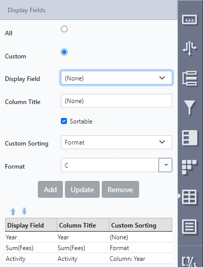
The following example shows how many students there are in each year level. To get this result, they added Year in the Schema Field and combined Student with the count function in Aggregate.
In another example, the user wanted to know how many students participate in each activity. To get this result, they added Activity in the Schema Field and combined Student this with the count function in Aggregate.
Aside from Count, the data aggregation can also be done with Average, Minimum, Maximum and Sum.
Distinct
The Distinct Results Only will filter out any duplicate records returned by the data connection. There are times when a data source column contains duplicate values. The distinct operation will be applied to all fields in the data, which may or may not be limited by the Schema Field restriction.
NoteIf aggregate schema fields are in use, the distinct checkbox will be disabled as the aggregate functions already group records into distinct groups.
In the example below, the data set was limited to the Activity column and the distinct check box used to display only unique results.
You can also combine two or more fields which means the combination has to be distinct. Similarly, adding more fields does the same thing as distinct ensures that a combination of ALL entries are unique.
In this example, there are duplicates of Cricket or duplicates of Aaron, but there are no duplicates of Cricket AND Aaron.
TipFor a more organized way of presenting the data, use the Sub Heading Field to display the first column as a heading to group results.
Sort Fields
Sorting allows you to change the order of your data. Sorting priority can also be set up giving you the ability to sort multiple levels. For example, sort by School Activity, then School Year, then Name of Student. Use the up and down arrows to set the order of priority.
NoteIf Schema Fields have been added in Results Transformation, Sort Fields will only show those options to choose from. This includes aggregated data lists.

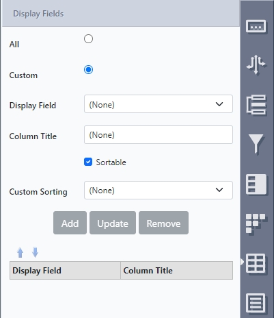
Display Field/s
For data question whose appearance type displays columns (namely Data Grid, Search or Popup), the display fields icon/panel appears to allow finite control of each column.
The default setting in Display Fields (right panel) is always All. Any changes made to Sort Filter and Results Transformation reverts the Display Fields settings to the default settings.
Property | Description / Examples |
|---|---|
Display Field | Select from the available options. This will show the available fields that have been set up in Results Transformation, if configured. If not, all available display fields will show as options.
|
Column Title | Specify a custom heading for the column. For example show “Name as Given Name” |
Sortable (Data Grid Only) | Display sort ascending/descending arrows in the column title so the user can arrange the records in an order that is appropriate for themselves. |
Custom Sorting | Overrides the default sorting and provides an alternative way to sort the column by using:
|
Dashboards
Data Grids in Dashboards show additional configuration types.
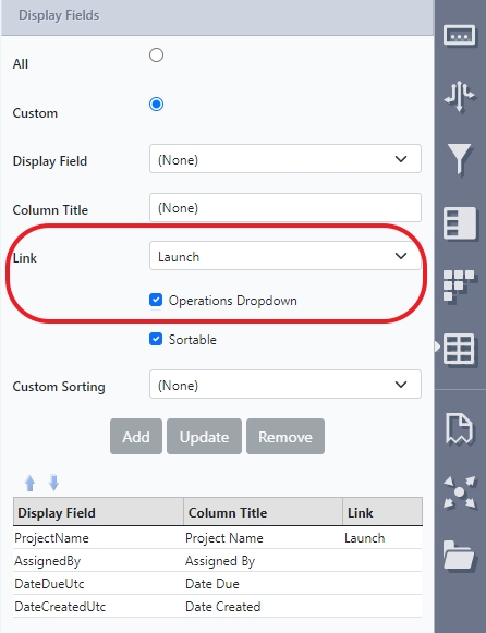
Launch Link
Selecting Launch from the drop-down list will change the text of any field into a link when the data grid appears in Produce. When clicked, the link will bring the user directly to the form. However, links may not appear if the current user does not have permission to access that form.
Operations Dropdown
Enabling this option causes a dropdown to appear in the selected display field/column of the data grid in Produce.

Operations or actions that appear are only those the current user can perform on the listed items and may vary depending on the data object type.
- For User type data objects, the operations that appear are only those the current user can perform on the listed items.
- For Admin type data objects, all possible operations will appear but will not execute if the current user does not have permissions to perform those operations.
Data Grid PropertiesThis option will only show in Display Fields if Selection type is None in the Data Question Properties.
Validation
NoteOften Data Source validation is used in automatic or bulk generation scenarios where data is passed by a third party system for document generation without user interaction
To ensure the quality of retrieved data, SmartIQ enables you to apply validation rules to data source questions. If a data field fails validation, SmartIQ will display an error message.

Data validation rules are applied in the same manner as text field validation; for more information see Text Field - Question Type.
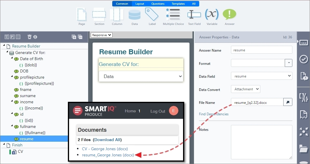
Answers and Data Fields
Each answer of a Data Question represents a single field from a record/row returned from a data connection. For example, "Id", “FirstName” and “data/client/Name”. The name of each field depends on the technology targeted by the data connection.

If the data field contains a value that conforms to a known structure, like a binary, date, number, html, etc., a data convert can be applied to the field so it can be processed as such at runtime.
For example, a data connection returns a text value of “2020-04-01”. However, it is known that the value is actually a date and should be displayed as 1 April 2020 or a date used in a days overdue calculation.
The available data covert types are explained in detail in the table below.
Data Type | Description |
|---|---|
Date | Use when the data connection returns a string/text value that is actually a date. A pattern is required to indicate which characters should be interpreted as the day/month/year and separator. For example the date “2020-04-01” has the pattern “yyyy-MM-dd”. The pattern must match the string format exactly for the parser to work. Note that the string " 5/01/2009 8:30 AM" cannot be parsed successfully with "M/dd/yyyy" because the time component is not included in the pattern. Additionally, the string "5/01/2009 09:00" cannot be parsed successfully with a pattern of "MM/dd/yyyy hh:mm" because the date string does not precede the month number with a leading zero, as the pattern requires. For details of what characters can be used in a pattern see Custom date/time format strings |
Number | Use when the data connection returns a string/text that is actually a number. At runtime, any white space will be removed from the value and the remaining text converted to a number. |
Image | Use when the inserting a binary file from a data source into a generated document. Additional properties such as height and width can be configured so the image can be appropriately inserted. At runtime, the value returned by the field must be one of (auto detected):
|
Text | Removes any leading or trailing white space from the value only. Useful only for fixed width text data. |
Html/Rich Text | Use when inserting HTML text into a generated document. Applies the formatting specified in the HTML in output file. For example, a value of “Some and text”. Would appear as “Some bold and italic text.” |
Attachment | Attaches the value as a file to the generated documents at submission. Useful for example, when passing the file to an action to send it to a recipient or system. Requires a filename to be specified for the file (this should include the correct file extension), mainly so the data can be opened with the right application once received. At runtime, the value returned by the field must be one of (auto detected):
|