
Introduction
Overview
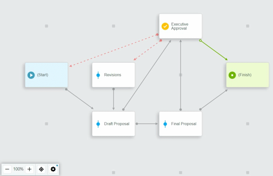
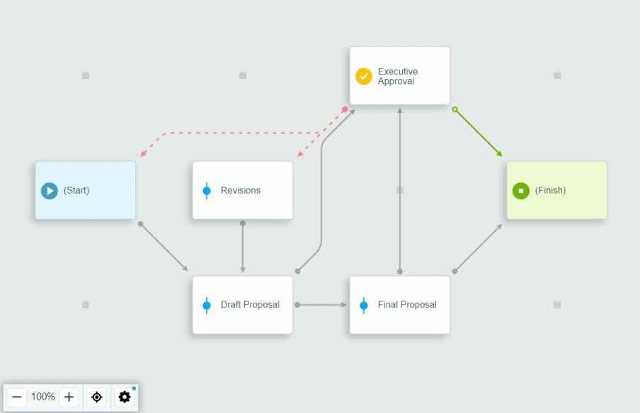
SmartIQ workflows are comprised of workflow states flowing from one to another via transitions, completed sequentially, or in parallel, from start to finish.
A full workflow streamlines business processes, allowing different users to collaborate at different phases or times. This automation uses business logic to help organisations perform consistent business processes and improve organisational efficiency.
The workflow interface shows the following:
- Diagram that provides a visual representation of the workflow
- Configurable properties for each state and transition
- Escalations and actions that can be added to the workflow
Workflow Interface
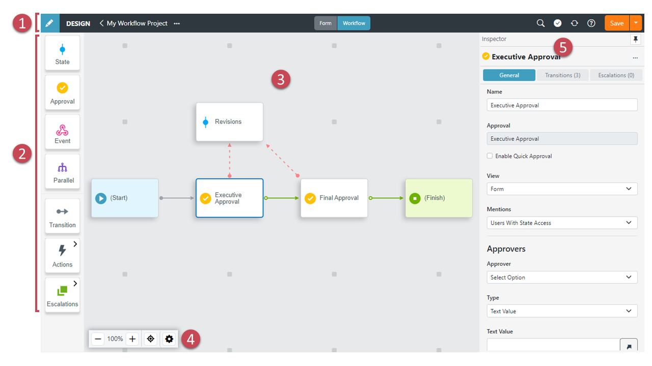
Each part of the interface is described in more detail below.
Global Nav Bar
The Global Nav Bar for SmartIQ Design, providing key project-level functions like Save, as well as an easy toggle between Form and Workflow views. For more information, refer to Global Nav Bar.
Left Panel
Each item in this panel is either a block ready to drag and drop onto the canvas, or a collection block that can be clicked to reveal a pull-out menu of blocks that can be dragged onto the Workflow Canvas. The left panel includes the following:
-
States – A workflow state is a stage or step in the workflow process. For more information, refer to Workflow States.
-
Approval – An Approval is a step in a workflow that acts as a gateway, where the responses provided in the form thus far can be reviewed and, if appropriate, altered before progressing. For more information, refer to Approvals.
-
Event – An external step in a workflow that needs to be actioned by a system outside of the SmartIQ platform via Cloud-to-Cloud Integration (C2I).
-
Parallel – Parallel blocks create a sub-process that allows multiple workflow states to occur in parallel by assigning states to multiple users simultaneously. For more information, refer to Parallel Workflows.
-
Transition – A transition is the link between the end of one state and the beginning of another, creating forward (and backward) paths within a workflow. For more information, refer to Transitions.
-
Actions – Actions provide a way to execute additional functions, whether calling an external system's API, sending an email or many other tasks. Actions are associated with workflow transitions and are executed when the transition is run. For more information, refer to Actions - Overview.
-
Escalations – Escalations are similar to Actions, except they occur based on time lapsed in the target state. For example, an escalation can be used to send an email reminder that a workflow task is overdue. For more information, refer to Escalations.
Workflow Canvas
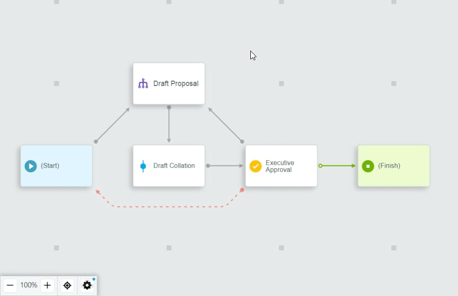
The workflow canvas provides an interactive visual representation of the workflow, with states and connecting transition lines. States are placed on a grid providing an easy and neat way to lay out your workflow.
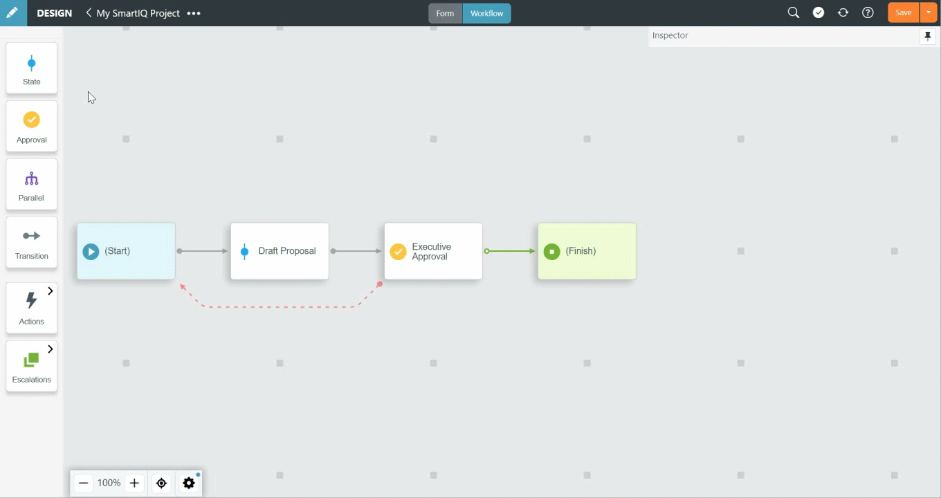
- Create workflows by dragging and dropping blocks from the left panel, and place in an available space in the grid. Once placed, states can easily be moved around the grid.
- Alternatively, states can be created by clicking an empty grid marker to reveal a pop-up menu.
- Create transitions by clicking on a state and dragging the transition to the next state.
- Clicking states or transitions from the workflow canvas opens the Inspector panel to enable editing that item.
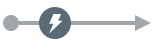
- Transitions with actions show an action icon. Hover over the icon to reveal the number of actions, or click the icon to open the Actions tab in the Inspector.
Transition with Actions
- States with escalations show an escalation icon. As with the action icon, hover over to reveal the number of escalations, or click to open the Escalations tab in the Inspector panel.
State with Escalations
- Editing parallel workflows drills into its own parallel workflow canvas, with a breadcrumb link to the parent workflow(s). Additional nested parallel sections follow this same pattern.
View Options
Use the View Options floating toolbar for more control over the workflow canvas in changing the display zoom and other view settings.
Available options:
- Zoom Controls – Use + and - buttons to increase/decrease zoom or click the zoom % to reset to 100%
- Center View – Centers content and zooms to fit the area.
- View Settings:
- Diagram
- Circuit Layout – Show circuit style layout of transitions, where transition lines go around states instead of direct paths. Default setting is off.
- Diagram
- Selection Focus (muted/hidden) – When a state or transition is selected, anything directly connected to it will be clearly visible, while everything not directly connected will be muted or hidden depending on which option is selected. This enables focusing in on a smaller area of the workflow and would be especially helpful for complex workflows. Default setting is off.
- Canvas
- Markers – Show/hide empty state placeholder markers. When hidden, you can still hover the empty space to reveal the + context menu for adding a new state. Default is to show markers.
- Grid – Show/hide grid lines surrounding state placeholders. Default is to not show grid.
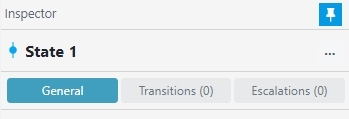
Inspector Panel
The Inspector Panel displays the available properties of the states and transitions in your workflow.
- The panel can be pinned to always show or unpinned (default) to only show when an item is selected.
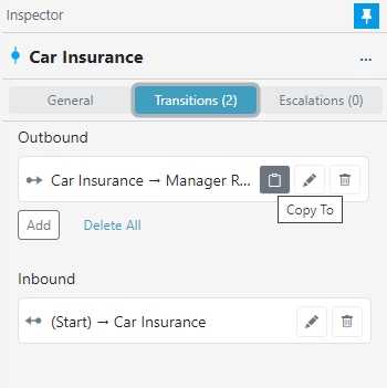
- Click the More Options (three-dot) menu to Delete or Copy To (only for Transitions).
- The tabbed view displays the tabs or sub tabs with the count of relevant items.
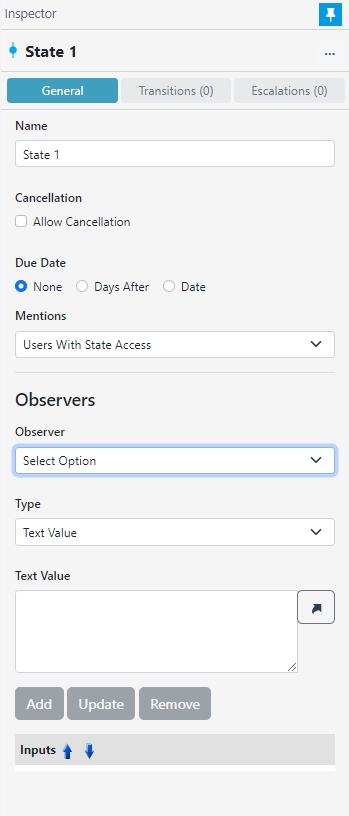
General Tab
Displays the general properties for whichever section in the form you have highlighted.
Transitions Tab
- Shows Outbound and Inbound transitions as lists.
- Click button to quickly Add a new outbound transition.
- Hovering a transition will highlight the transition in the workflow canvas.
- Buttons to quickly Copy To, Edit or Delete the transition.
- Delete All option to quickly delete all outbound transitions.
See Transitions for more information.
Escalations Tab
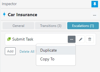
- Click button to quickly Add new escalations.
- Click the More Options (three-dot) menu to Duplicate or Copy To the escalation.
- Buttons to quickly Edit or Delete the escalation.
- Delete All option and confirm to quickly delete all escalations in one go.
See Escalations for more information.
Others
Other things to consider in Workflow are:
-
Email Approval – which only work for workflow approval projects. For more information, refer to Email Approval.
-
Track Changes – This features shows the history of who made a change when it was their turn. For more information, refer to Track Changes.
Updated about 1 year ago