
Enhancing the Design Experience
SmartIQ IQ17 introduces some exciting changes to the project design experience. This article is aimed at existing trained users of Design to help understand what has changed from previous versions of the platform.
Unified Navigation Experience
The Design user interface has been updated with the new Global Nav Bar, providing common structure between SmartIQ apps and the broader Smart Communications Conversation Cloud™. This change also brings improvements and better visibility of key functions like save and the workflow toggle.

The new Global Nav Bar includes a refresh to the Design Application Icon, and rearranges the position of buttons - including making Save more prominent, with Save As now in the sub-menu, and providing a much clearer toggle between Form and Workflow editing of your projects. Project Properites has been moved into the More Options (...) menu in preparation for further improvements to come.
Introducing the New Workflow UI
Clients will notice a new, more modern look when creating and editing workflows in SmartIQ. Redesigned to simplify building and maintaining workflows in Design, users can still access all the underlying functionality that was there before—and existing workflows will continue to operate exactly as they always have.
Overview of enhanced UI components:
| Component | Description |
|---|---|
| Left Panel | The toolbar of workflow elements that was across the top has replaced with a refreshed left panel, freeing up more vertical space for the work area. The left panel now includes pull-out menus for Actions and Escalations, allowing them to be added quickly by simply dragging them directly onto the relevant state or transition on the workflow canvas. |
| Inspector Panel | While restructured to fit the new aesthetic, the Inspector Panel (previously called Properties Panel) still contains all the properties about the selected state or transition as always - but has been significantly boosted to allow so much more visibility and control - for example, you can now see a list of inbound and outbound transitions. In the Actions tab you can even drag and drop to re-order them, saving designers from having to delete and recreate. |
| Workflow Canvas | The workflow canvas brings a whole new visualisation of the workflow states and transitions, and a raft of new interactions to make editing your workflow much more efficient. |
| View Options | All new floating toolbar of view options to give you more control over the workflow canvas - from zoom, to centering through to switching on and off features. |
More info about each of the components can be found below.
Simplified Interactions
In addition to keeping all prior functionality, we have added new interactions that can help you create workflows more quickly. For example, you can quickly create transitions by dragging a line between two states or simply adding in the Inspector Panel.
Some of the new ways to interact with your workflow include:
- Adding new states and transitions has never been this easy. Drag and drop onto the canvas from the Left Panel is still supported, but you can now make use of the context menu on position markers for adding states directly on the canvas, and then simply drag new transitions between them, all right in the diagram.
- Do more than ever with the Inpsector Panel including add transitions, Actions and Escalations directly where you update their properties.
- Change the order of Actions in the Inspector Panel simply by drag and drop or using the More Options menu - the days where you had to delete and recreate to change the order of Actions are over!
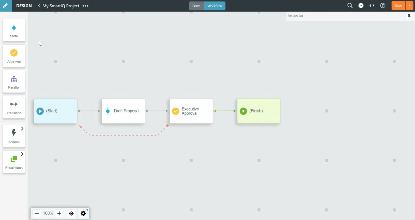
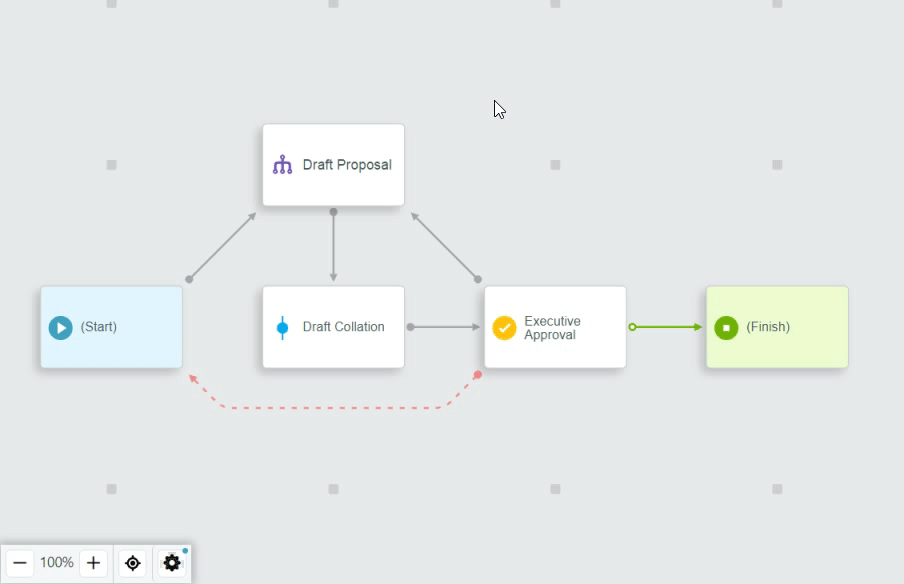
Enhanced Workflow Canvas
Users will notice several updates to the workflow canvas. One of the most notable changes is that it is now an interactive workspace that allows Designers to add workflow elements directly on the canvas. IQ17 also offers a larger canvas area, providing more space—and States are now a consistent shape, differentiated by color and iconography for a crisper, cleaner visual representation of workflow design.
The enhanced workflow canvas makes better use of the space with its horizontally-oriented visualisation of your workflow on a grid - and existing workflows are automatically placed on the new grid, but can easily be moved around to your liking.
Parallel Workflow
The canvas presents Parallel workflow sections quite differently from before - where it used to all be one diagram, its now a drill-in to open each parallel in its own canvas. This allows a lot more room for growth without complicating the main paths of your workflow.
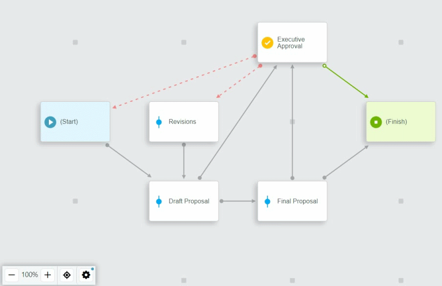
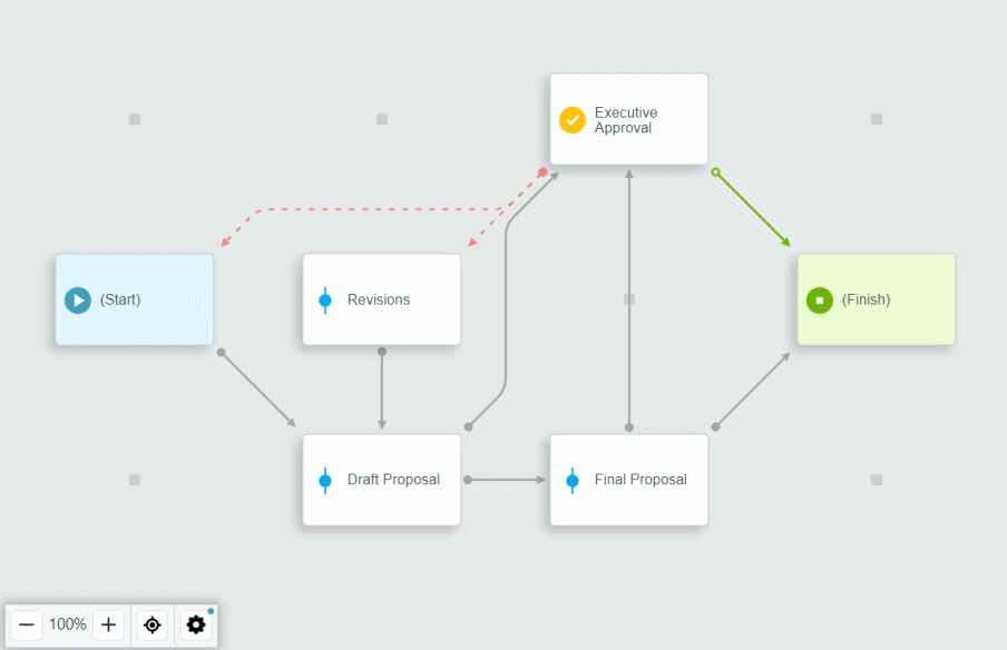
Circuit Layout
The circuit layout view option is a new way of visualising the workflow - in particular the transitions between states. Rather than straight lines between states, this new layout feature ensures transitions follow circuit-like paths around states instead of crossing behind them - providing a potentially cleaner and clearer view of your workflow.
Of course straight line paths are still supported, and in some cases provides the best outcome, so we've made the choice of layout up to you. To enable or disable circuit layouts, simply select the option in the View Settings menu.
Selection Focus Mode
To further help you see what's important while editing a workflow, Selection Focus is a feature that mutes or hides away elements that are not directly connected to the item you have selected.
When nothing is selected, all workflow elements are clearly visible as normal, but when you select a state or transition on the canvas then everything not directly connected is muted. If you want to go a step further, you can choose to make the muted items actually hidden from view completely - providing a truly clean focussed mode that might be useful for screen captures and documentation purposes.
Additional Workflow Canvas Features
Some further enhancements you can try out with the canvas include:
- Click an empty placeholder to show a context menu for adding a new state.
- Hover on a state to reveal a port to drag and drop new transitions
- Transitions with actions show an action icon on the canvas, while escalation icons appear on the relevant state - and when you hover an action or escalation icon it reveals a tooltip with a count. Clicking on the icon acts as a shortcut to take you to the Actions or Escalations tab in the Inspector Panel.
- Drag and drop to move a state to any available space, and if you drag a state to the edge of the visible canvas area it will scroll in that direction to reveal more spaces.
Inspector Panel
The Inspector Panel has been re-organized to make it easier to explore the available properties of the states and transitions in your workflow.
Pinning
The panel width can still be resized as it always could, and you can now choose to pin or unpin the panel. When pinned, it will always be visible even when nothing is selected on the canvas, and when unpinned it appears only when something is selected.
Tabbed view
The Inspector Panel is provides a tabbed view to help arrange items logically, with main tabs and sometimes sub tabs. Where a tab reveals a list of items, such as Actions, a count of the items is included in the tab title for easy at-a-glance detail.
The actual properties available have not significantly changed from previous versions.
Inspector Panel for States
You can now easily access Transitions and Escalations for workflow states directly on the Inspector Panel, and also edit, delete or create new ones.
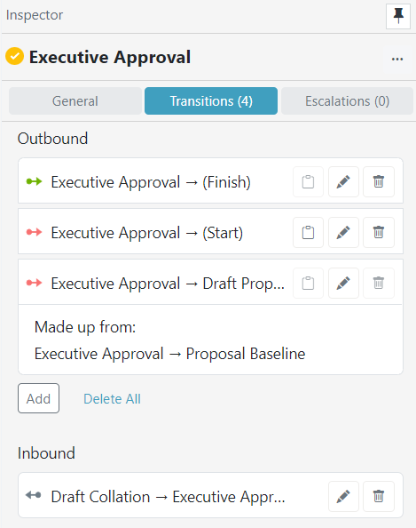
The Transitions tab shows both Outbound and Inbound transitions, and where transitions to states in Parallel sections are included the list of individual transitions are available to help increase visibility.
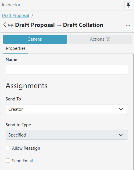
Inspector Panel for Transitions
The General tab for Transitions contains all the familiar properties, while you can easily add and edit Actions on the Transitions via the tab on the Inspector Panel.
Transition Actions Tab
Actions can now be easily re-ordered via drag and drop, or using the Move Up and Move Down options in the More Options (...) menu. You can also copy Actions from the current transition to another one in the project using the More Options (...) menu.
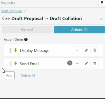
Nested actions now have their own dedicated tab, still allowing you to nest as many levels deep as needed.
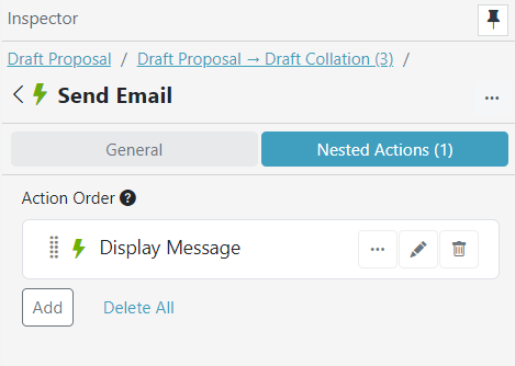
If the parent Action is configured to be repeating based on a data source or repeating section then you can add nested Actions. When an Action includes any nested Actions, it will display a count of them in the Actions list.
Updated about 1 year ago