Design - Right navigation
Properties
This displays the properties for whichever section in the form you have highlighted.
Possible Options | Description |
|---|---|
Question Text | Type in the question text. |
Text Position | Options are: |
Data Source | Options are: |
Table View | (None) |
Visible | Checked by default |
Selection | Choices are: |
Appearance | Options are: |
Display Field | The table column you wish to use as the name. |
Unique Field | The unique field for selecting data. |
Mandatory | Whether the field is mandatory. |
Default Type | The default type. |
Help Text | Help text can be added to give additional information about what is being requested in the question. This is a rich-text box. |
Comments | Check this box to allow comments. It is unchecked by default. |
Style | The options can be:
|
Find Dependencies | Clicking this link will open a pop-up window that will show any dependencies that this label has. |
Page Title | This is the title of the page. |
Repeating | Whether it is repeating. |
Document Format | Options are:
|
Data Field | The corresponding column within the table. |
Notes | Write comments or notes for collaborative form design purposes. If the notes field has content, an icon appears beside the item in tree view. The contents can be seen when the mouse is hovered over the icon and, if double clicked, redirects the designer to the note box. This can be done for the following:
|
Conditions
For more information on how to use conditions see Conditions - Overview.
Possible Options | Description |
|---|---|
Conditions For | Options are: |
Type | Options are: |
Question (available when Answer Value is Chosen for Type) | includes options for available questions in the form. |
Answer (available when Answer Value is Chosen for Type) | includes options for available questions in the form. |
Fragment (available when Fragment Output is Chosen for Type) | includes options for available fragments in the form. |
Output (available when Fragment Output is Chosen for Type) | includes options for available fragments in the form. |
Comparison | Options are: |
Add | Update | Remove | Making changes to the above options will highlight the Add, Update, and Remove options. Changes will be shown in the box below these options. |
Data Filter
Possible Options | Description |
|---|---|
Filter Field | Options are: includes options for available questions in the database. |
Comparison | Options are: |
Type | Options are: |
Question | Options are: includes options for available questions in the form. |
Answer | Options are: includes options for available questions in the form. |
Add | Update | Remove | Making changes to the above options will highlight the Add, Update, and Remove options. Changes will be shown in the box below these options. |
Sort Fields
Possible Options | Description |
|---|---|
Sort Field | |
Direction | Choose: |
Add | Update | Remove | Making changes to the above options will highlight the Add, Update, and Remove options. Changes will be shown in the section below these options. |
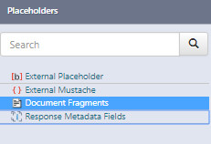
Placeholders
For more information see Content Library - Question Type
NotePlaceholders and actions are not available for dashboard projects.

Fragment
This option shows any fragments associated with a project.
Actions
Actions show all Actions available in a project.
For details on Actions see the Action knowledge articles.
Content items
Shows all content items associated with the project.
Updated 11 months ago
