Designing Themes in Theme Builder
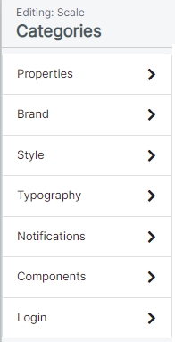
Themes provide a set of attributes you can configure to change the look and feel of SmartIQ Produce to suit your brand. Theme attributes are grouped into high level design categories which provide an easy way to navigate and modify your themes.
In Theme Builder, while modifying a theme, you can navigate around the various categories and make any changes you like, even see a live preview of those changes, all without saving the changes. Only once changes are saved can users see them take effect in Produce. Alternatively, you can cancel the changes to keep the theme as it was when last saved.

This page describes each of the design categories in more detail. For general overview and usage information, refer to Theme Builder.
Color PickersClick the sample color circle beside any color to show a pop-up color picker. Use the sliders to choose hue, saturation and brightness to find a suitable color, or type a valid hexadecimal color value. The color picker also provides color swatches across the top, allowing you to quickly re-use a color previously set within the theme.
Properties
Attribute | Description |
|---|---|
Theme Name | Modify your theme's name. This value must not be empty, and cannot be the same as any other theme. Maximum of 50 characters. |
Brand
Colors
Attribute | Description |
|---|---|
Brand Primary | Applied to the most visually prominent components, primary color is used on main titles, primary buttons, check boxes and radio controls. It's also used to accent various elements including tabs, page navigation and the wait animation. |
Brand Secondary | Used on secondary buttons, toggles, accordion tabs and publish folders. |
Header Background | The background color of the main header shown on Produce home, form pages and dashboards. |
Header Text | Used for text on the header including the form title. The text color should contrast with the header background for readability. |
Header Link | Used for links on the header. The link color should contrast with the header background for readability. |
Header Link Hover | Used for links in the hover state. The hover color should contrast with the header background for readability, and is often set to a slightly lighter or darker shade of the link color. |
Logos
Attribute | Description |
|---|---|
Site Logo | Defines a logo to show in the header on full screen devices. Recommended maximum pixel dimensions is 385 (width) x 100 (height). Supported image formats are BMP, JPEG, GIF, SVG, and PNG. |
Logo Size | Provides a slide control to adjust the size of the main logo for use in the header.
|
Small Logo | Defines a smaller logo to show in the header on mobile/small screen devices. Recommended pixel dimensions are 60 x 60. Supported image formats are BMP, JPEG, GIF, SVG, and PNG. |
Favicon | A very small logo used in the browser for tab and bookmarks, depending on browser support. Recommended pixel dimensions are 16 x 16. Supported image formats are PNG, ICO and SVG. |
Logo ScalingWhen you select a site logo, if you don't already have a small logo, it will default to the same as the site logo and apply down scaling. Equally, if you select a small logo before choosing a site logo, the site logo will be an upscaled version of the small logo. To change either case, simply override the logo applied.
Scaling of images, especially upscaling, can create poor quality results.
Style
Attribute | Description |
|---|---|
Shape - Corner style | Sets the corner style for all buttons and inputs.
|
Depth - Button elevation | Sets whether shadow is used to create an elevated effect on buttons. Note that only primary and secondary buttons are affected. Options are:
|
Content Width | Sets the ability to control the width of the form content, which changes the left/right margin padding sizes.
Note: On smaller screens with less horizontal resolution, content is always set to 100% of available space regardless of the Content Width setting chosen. |
Typography
Fonts
Attribute | Description |
|---|---|
Font Stack | Select the preferred font stack from the drop-down list.
|
Click Show output to reveal the underlying font-family CSS that will be used in the style for the chosen font stack.
Custom fonts can be added via the content library if additional fonts are required, see Custom Fonts
Colors
Attribute | Description |
|---|---|
Page Title | Page title appears on the top of every form page. |
Question Text | Question text color including the various position options of top, left or floating. |
Body Text | Defines the color of input text and labels, as well as any other text not associated with another text style. |
Link Text | Anchor link text color includes project links on the home page, link buttons (such as save), and any anchors in labels. |
Link Hover | Provides a hover color for anchor links. |
Weight
Attribute | Description |
|---|---|
Heading Weights | Select how light or heavy to make headings appear, including page, section and column titles.
|
Not all heading weights are supported by all fonts in all font stacks, and so results can vary from system to system. Most modern systems will support a variety of font weights when using the Sans Serif font stack.
Attribute | Description |
|---|---|
Global Scale | Select the relative size of all fonts. Options are:
|
Notifications
Messaging Colors
Attribute | Description |
|---|---|
Error | Sets the color used for validation or other errors that may be displayed in the page navigation, input field or finish page. |
Warning | Color for warning labels and messages. |
Success | Color for success labels and messages such as form submitted toast messages. |
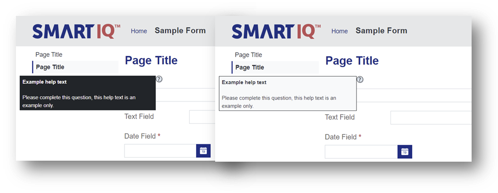
Help Text
Styling of the help text boxes used at the question level. Select from a light (default) or dark option to reflect the overall aesthetic of a theme.

Components
The Components menu provides advanced options to override components like Buttons and Headers.
Buttons
Attribute | Description |
|---|---|
Primary and Outline | Provides advanced options to override the default values for primary and outline buttons. Options are:
|
Toggle | Provides advanced options to override the default values for toggle buttons. Options are:
|
Link | Provides advanced options to override the default values for link buttons (such as the Save link button). Options are:
|
Header and Navigation
Attribute | Description |
|---|---|
Header Border | Provides advanced options to override the default values for Header borders. Options are:
Note: You can select Fixed Header to keep the header and navigation area fixed in place, while the main form question area is scrollable. |
Navigation Style | Provides advanced options to override the default values for the navigation styles and provides a bolder look that works well for some themes. Options are:
|
Login Page
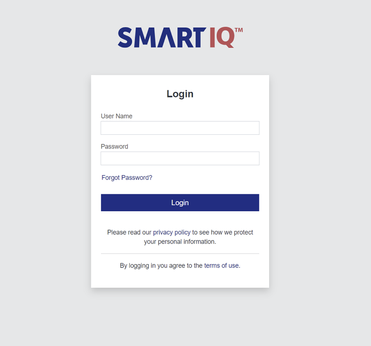
Theme Builder can be used to style the login page using your brand’s primary color and logo. You can override the default login page logo, as well as setting a solid color or image to use as the background of the login page. This enables dynamically rendering a new, on brand login experience on the various login, reset and access code screens used for unauthenticated users.
If the logo is left blank, Theme Builder will use the Brand Logo by default.
Enabling the Apply theme to login option will apply the selected site theme to the following:
- Login page
- Forgot password page
- Send request page
- Reset password page
- Temporary user access page
- End User License Agreement (EULA) page
If a direct project URL is used, for example, when a direct link is emailed as part of a workflow, and there is a theme set for that published project, the login page will show the published project theme instead of the site level theme.
Using the themed login pages provides a branded experience based on the primary color and featuring the main header logo and background color, as well as various other theme colors.

Login Page and Custom CSSEnabling the Apply theme to login option will prevent any custom CSS from loading during login, and so will not be able to apply custom CSS to any login pages. If this is required, do not enable this option.
Updated 11 months ago
