
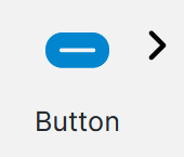
Button
The Button question is a simple clickable Button or Tile (a button with an embedded image and size options) that can drive conditions, navigation, progression, and any other case where a user needs to perform a simple click interaction.
Usage
Button questions don't provide the user with feedback that a button has been clicked, so a Choice question may be of more in this case. Add the Button question into the desired location in the project or Pages Panel.
In a dashboard, the option to force refresh is available when the type is set to refresh, that will force reconnect to the server.
Properties
| Property | Description |
|---|---|
| Text position | Top, Left, none as standard. |
| Size | Small, Medium, Wide and Large are the options. They appear in the preview so the user can see how they will look. |
| Title | (optional) This is text that appears on the bottom right of the button. This shows in the preview. If the title is too long it will just be cut off - it does not wrap. |
| Badge | (optional) This is small text (75% of the title size) with a dark background that appears at the top right of the button. This shows in the preview. If the badge is too long it will just be cut off - it does not wrap. |
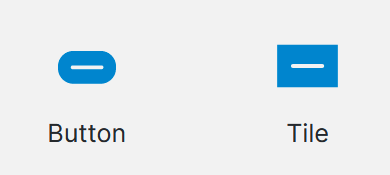
| Display Type | Tile (default) or Button. Selecting Button disables the Icon and Badge inputs of these will not be used by the Button display. Selecting Button also enables the Button Style input, which is not used by the Tile display. (see below for more) |
| Button Style | (Shown for "Button" display type only) If no style is selected, or none are available, the question will use a default style matching what is shown in the Design preview. |
| Icon | This is an image that appears in the center of the button - if the image loaded is too large it will not appear centered and may overlap the title or not fit on the button at all. It is visible in the preview. |
A color picker is used to select and show the colors for properties or you can enter a manual hex code.
Type Options
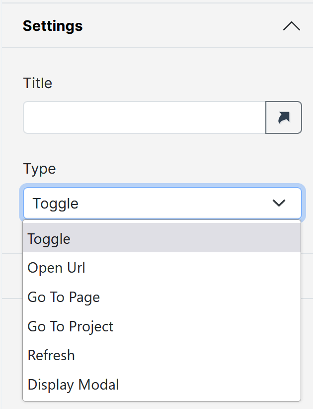
| Option | Description |
|---|---|
| Toggle | Allows for actions based on whether the button answer is selected or not. Button toggle color -** will replace the default blue of the button when selected - you cannot toggle the button in the preview, so you cannot preview this setting. |
| Open URL | Allows a URL to be entered, this URL will be opened in a browser when the button is clicked. Open In New Tab - Will open the URL in a new tab, if selected or will open the URL in the current tab if not selected. |
| Go To Page | Allows a page within the same project to be selected. The page will be redirected to when the button is clicked. |
| Go To Project | Allows a folder and then a project to be selected. The page will be redirected to the selected project when the button is clicked. |
| Refresh | Allows to perform a PostBack when clicked. |
| Display Modal | Allows a section within the same project to be selected. The modal will open when the button is clicked. |
Blurry Text
You might notice that some of the text on your buttons is blurry.

This can happen because there's a text shadow from the original base style. Ensure that the text-shadow setting is disabled to fix it.
Button Question Type cannot be used as a Condition
Updated 23 days ago