
Layout Blocks
Pages
Pages are the core building block of forms and dashboards that everything is contained within. Each page will appear as a separate page to the end user in produce, that they will have to switch between.
The finish page is a unique page and exception present in forms that provides the submission button.
Sections and Columns
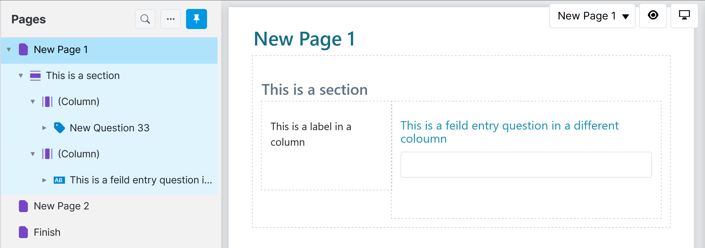
A section is a way of organizing questions into columns. This provides more flexibility in the layout of the web form and provides a neater way of representing a related group of questions.
Sections may also be configured to repeat, to collect multiple rows of columned data much like a table. For more information about repeating sections, refer to Repeating Sections.

Usage
Sections can be added to pages, or even nested within other columns or tabs. They are comprised of section columns to arrange questions across the page.
Titles and descriptions can be added to sections, as well as column titles to provide more information or context for the end user.
How to add sections and columns
-
Create a page (refer to Pages).
-
From the toolbox drag a Section onto the appropriate page in the question set.
-
On the Properties tab, complete the following properties:
| Property | Description |
|---|---|
| Title | Optional. Provide a title for the section, to be displayed in Produce. |
| Description | Optional. Provide a description for the section, which may provide the user with more context information. |
-
From the toolbox drag a Column onto the section created above. Note: there is no limit to how many columns you can add, but you should be mindful of readability.
-
On the Properties tab, complete the following properties:
| Property | Description |
|---|---|
| Title | Optional. Provide a title for the column, to be displayed in Producer. |
| Width | Optional. The columns on a page must occupy its full width, so this property is only available when more than one column is added to a section. Set the width as a percentage or number of pixels, using the drop-down to select which. By default the width is set to ‘0’, which automatically stretches to fit. If you wish to add an empty column for spacing, you will need to add a blank label to it, otherwise it will not be displayed. |
| Help Text | Additional information to display when the question’s help icon is clicked. Help text can also be formatted using HTML. |
- Add further layout types (refer Layouts) or question types to the column as required.
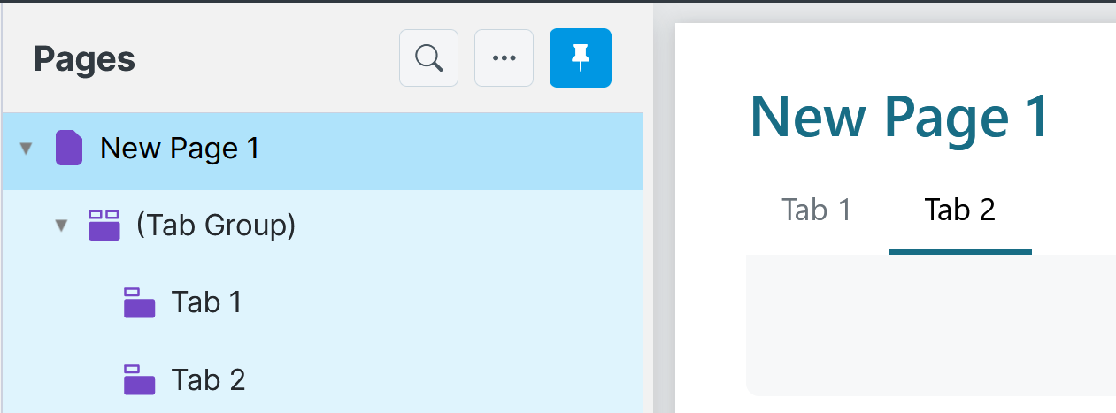
Tab Group and Tabs
A tab group, like sections and columns, is another way of organizing how questions are presented to users in Produce. Questions within tab groups are organized into one or more tabs as shown below.
Question Reference
Tab now supports question references. You can put the question reference into a Tab Page Title, and it will render on tab groups and accordion tab groups.
Tab groups can also be presented in an accordion style.
Usage
Users navigate between tabs to answer all the relevant questions, ensuring a single screen does not appear too ‘busy’. For example, contact information could be separated into ‘Home’ and ‘Work’ tabs.
How to add a tab group and tabs using SmartIQ Design
- Open a new project in Design
- From the toolbox, drag and drop a Tab Group onto a page.
- From the toolbox, drag and drop a Tab onto the tab group.
- In the tab’s properties, type a meaningful name for the Title property. The title is used to navigate between tabs in Produce.
- Add further layout types (Layout Types) or question types if required to the tab and then save your project.
Accordion Tabs
An Accordion Tab Group displays vertically on the user's screen. Each Tab can be expanded/collapsed to hide or show its content. Only one tab can be expanded at a time.
To enable Accordion Tabs, check the Accordion option on the Tab Group's properties.
Updated 5 months ago