
Design Overview
Design is the web app used to make and edit the various types of project your organization requires, and is used to set up the Workflow for the projects too.
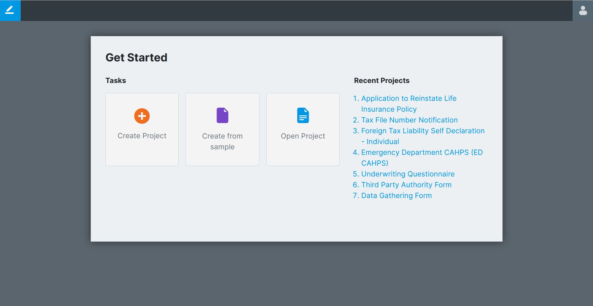
Dashboard
From the design dashboard you can create and open projects or kick-off from one of the pre-made sample library forms.
Top Right buttons
The buttons in the top right include a feedback button, a find/replace button, validate, refresh lists, help, cancel, save and save as.
Validation
The Validate Project function is a useful way to determine if there are any problems with your SmartIQ Project. It should be the first action taken if a Project is failing somehow or doing something that is unexpected.

To validate a Project, click the Validate Project button. If there are any issues they will be displayed at the bottom of the Design screen

Double-clicking on any line in the results will navigate to the offending item. If there are no issues a popup will appear saying there are no issues.
Validation Blocks
| Group | Blocks |
|---|---|
| Reference Tags | Page Repeat Titles, Question Default Values, Question Text, Finish Properties, Section Descriptions |
| Formulas | Variable Formulas, Data source Formulas, Rule Formulas/Aggregates |
| Conditions | Question Conditions, Transition Conditions, Action Conditions, Document Conditions |
| Placeholders | Non-External Placeholders, Page Repeat Placeholders, Data source Repeat Placeholders, Section Repeat Placeholders. External Placeholders are validated that they appear in attached Document Fragment Content Items. If a Placeholder doesn't exist, it will appear in the Validation Results as a "Message". These can be shown or hidden by clicking the "Show/Hide Messages" button at the top right of the Validation Results window. A Placeholder not existing may be valid if you intend to publish your project with a Layout. |
| Data | Connections, filters, fields |
| Answers | No missing answer blocks, answer file |
| Content library | items exist, invisible, labels are unique |
| Actions | Order of operations, repeat actions |
| Repeat | Repeat source |
Refresh Lists
This will clear the cached lists of items from Manage so that the user can see new changes without having to reload the project.

Help
This button will take you to the knowledge hub landing page.

Save
Save your projects regularly. Projects in design do not Autosave.
| Click | Option | Description |
|---|---|---|
| Project Name | This is populated by default, but you can change to a new name. | |
| Content Folder | This defaults to (None), but you can change this to point to any of your project folders. | |
| Publish | Selecting this will publish your project in addition to saving it. | |
| Copy to Fragment | Selecting this option enables copying a section of your project into a fragment page or portion:
| change to a new name.", |
Project Configuration Menu
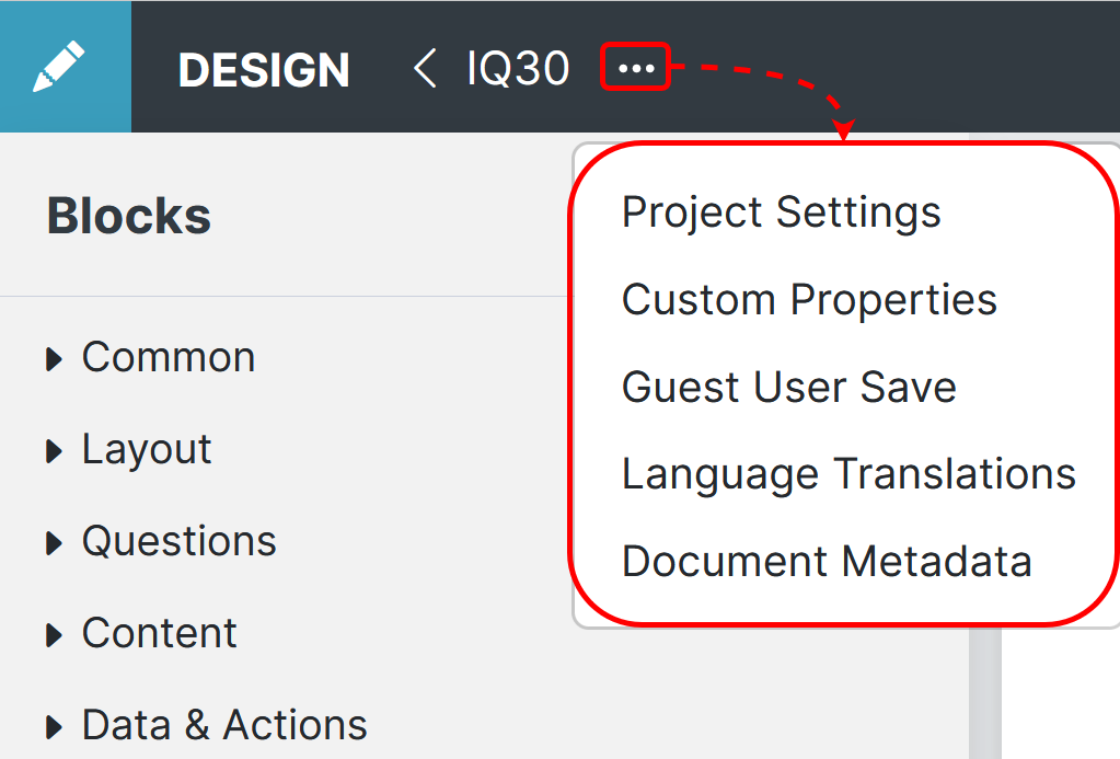
The Project configuration button '...' contains the items used to control the project as a whole.
Blocks Panel
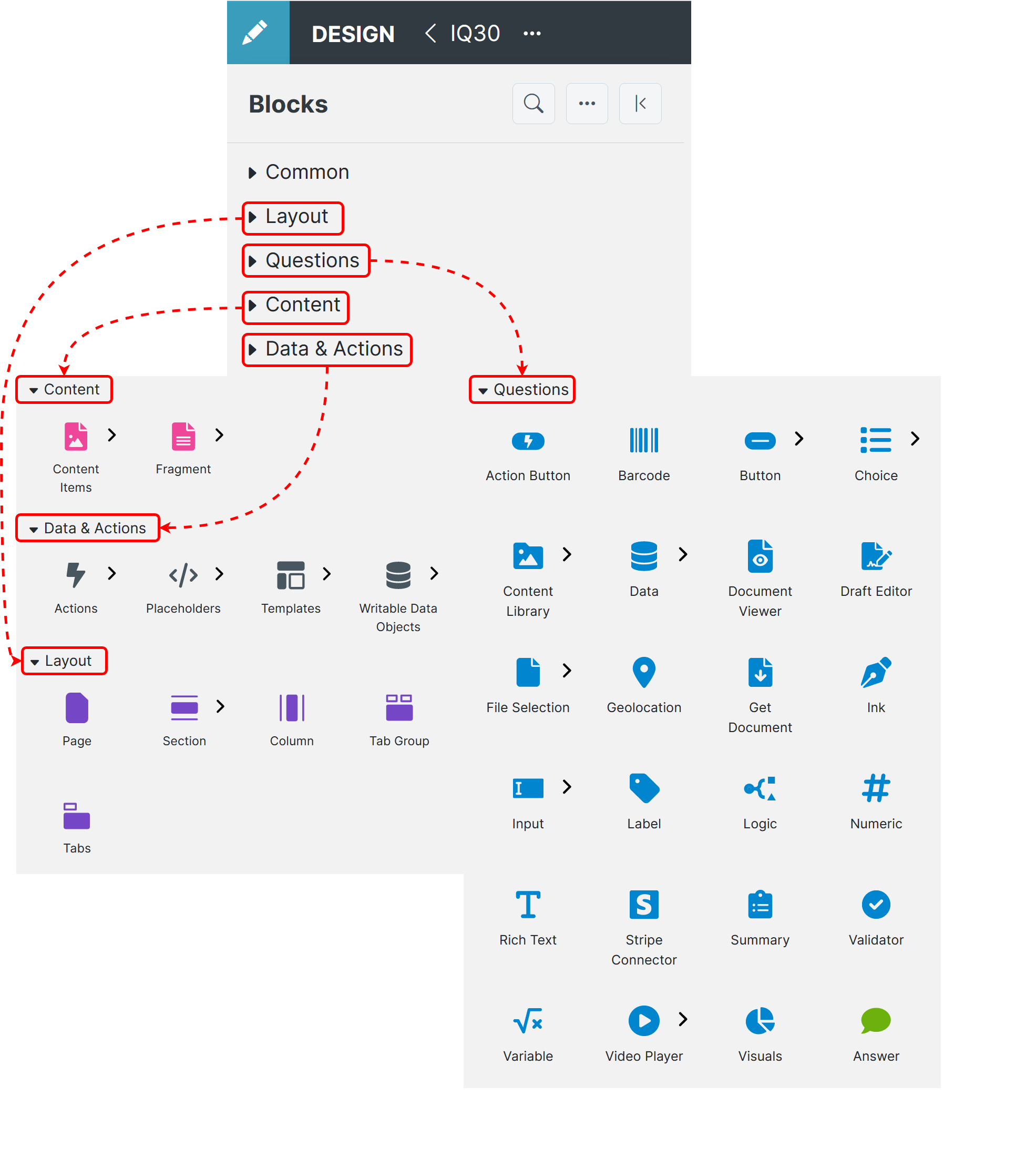
These are the core building Blocks used in 'Design', that give SmartIQ forms their functionality, organized into Layout, Questions, Content, and Data & Actions. These blocks can be added to the project by, dragging them directly onto the project or into the pages panel, or by clicking the contextual add button that appears in the project when hovered over.
| Block Type | |
|---|---|
| Layout | |
| Questions | |
| Content | Content Items |
| Fragment | |
| Data & Actions | Actions |
| Placeholders | |
| Templates | |
| Writable Data Objects |
Pages Panel
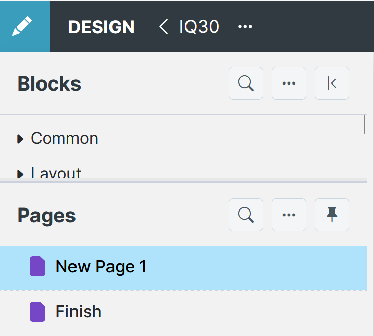
The Pages Menu lists all the content, and its structure, in the form all in one place, from simple questions to actions.
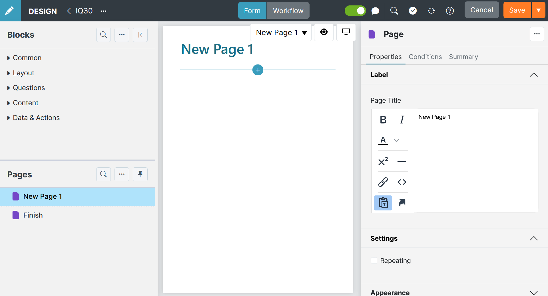
Inspector Panel
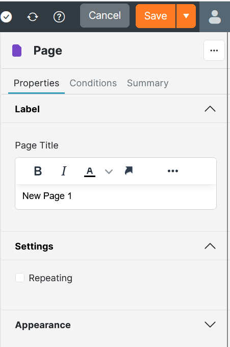
The Right side 'Inspector panel' shows the Properties/Conditions/other of whatever Block has been selected in the Pages panel. Each separate Block has its own Properties/Conditions/other that are used to control the block, connect it to other blocks, and select how the block functions.
Properties are individual to each block and control the design, function and restrains of a block.
Conditions are important automation tools that most blocks have, controlling when to turn on and off certain properties of the question, based on the user selections for other blocks.
Workflow Interface
The Workflow Interface in Design is a tool for putting together business workflows for the project they are part of. Workflows use business logic and allow different users to collaborate at different phases/times within its project.
The workflow interface provides a visual representation of the workflow and the configurable properties for each block that can all be added to the workflow canvas.
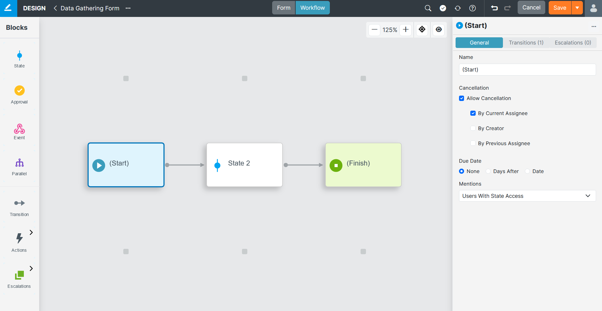
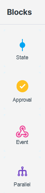
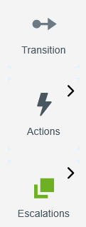
Blocks Panel
Each item in this panel is either a block ready to drag and drop onto the canvas or a transition, action, or escalation.
Clicking blocks or transitions placed in the workflow canvas opens the Inspector panel to enable editing that blocks properties.
Inspector Panel
The Inspector Panel displays the available properties of the states and transitions in your workflow, the sames as the form design inspector panel.
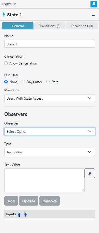
This panel contains the General, Transitions, and Escalations options of whatever Block has been selected in the canvas. Alternatively for transitions, it will contain the General and Actions options. These properties are individual to each block, transition, escalation, and action.
View Options
Use the View Options floating toolbar for more control over the workflow canvas in changing the display zoom and other view settings.
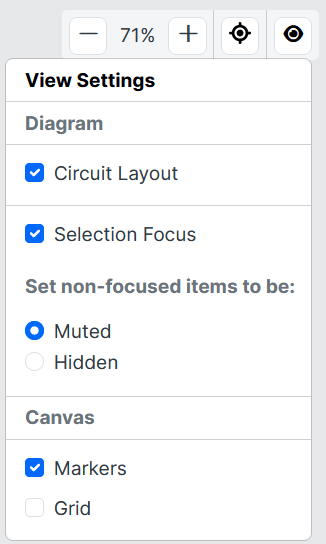
Selection Focus (muted/hidden) – When selecting a block anything directly connected will be clearly visible, while everything not directly connected will be muted or hidden.
Updated 10 days ago