
IQ30.1 Release Overview and Notes
Released 22 October 2023
Welcome to IQ30!
The IQ30 milestone release of SmartIQ has delivered an exciting new project design experience. In this major update we have re-envisioned the UX, bring in a new Design UI that hopefully some of you are already familiar with and loving.
The overall approach to this refresh was to create an interface with tools that are easily discoverable for users and that provide the powerful features needed for SmartIQ projects.
There are a plethora of changes to more than just the Design UI, like new features and changes to terminology, all outlined below.
Feedback
We want to hear from you!
If you’ve been exploring the new Design interface, you’ve already located the “Try New Design” toggle. If you switch back to the existing UI, you are given an opportunity to send feedback on your experience. You can also do this any time while you are in the new Design UI by clicking the “chat” bubble icon located in the Global Navigation bar.
Whether something didn’t feel as intuitive as it could or you had trouble finding what you need—or anything else—we want to know.
Changes
Knowledge hub
The aim of the knowledge hub restructure has been to streamline new users into the SmartIQ system while supporting existing users, by aligning the structure with that of SmartIQ itself. You will also find a new Sitemap and a Glossary page for ease of reference to pages and terminology.
Side by side we have the old knowledge hub and new knowledge hub structures.
Changed/New Terminology
| Previously IQ29 | Now IQ30 | Information |
|---|---|---|
| Auto Logic | Logic | In reference to the logic question type |
| Run Action Button | Action Button | In reference to the action button question type |
| Multiple Choice | Choice | In reference to the choice question type |
| Text Field and Number Field etc | Input Field | In reference to the input field question type |
| Form Summary | Summary | In reference to the summary question type |
| Project Property | Custom Properties | In reference to the custom project properties for metadata |
| Custom | Custom Table | In reference to the Custom Data Object option in SmartIQ data connection |
| New | Description |
|---|---|
| Reference Tags | Describes the tags that use '[ ]' formatting both for referencing both the constant values and the question answer references. |
Undo and Redo
One of the most customer requested features has finally been released; the Undo and Redo functionality. But beware, it supports no more than 10 snapshots of history in either direction.

Blocks Panel
The all-new Blocks panel on the left-hand side replaces the top bar as well as several other fly-out menus from the existing UI. This provides an easier, more organized way to find content to add to your projects.
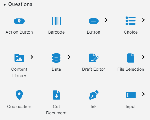
Blocks are a combination of individual elements that can be added to your project with a single click and grouped elements that are a collection of related blocks, as indicated a chevron.
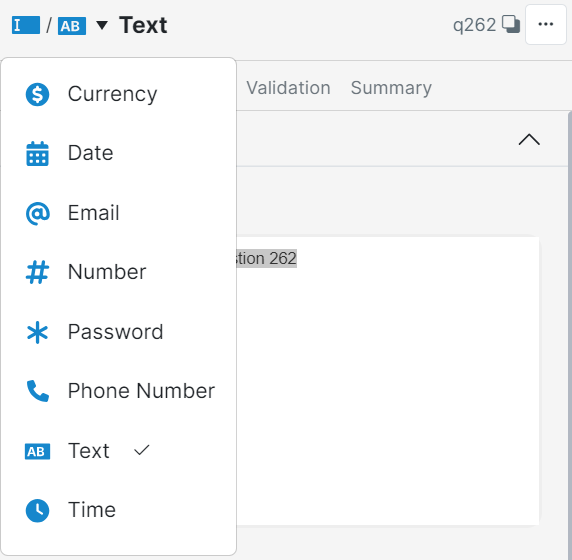
For example, in the image above, the Draft Editor is a simple block you can click on and add directly, while the Input block provides quick access to various types of input as depicted below.
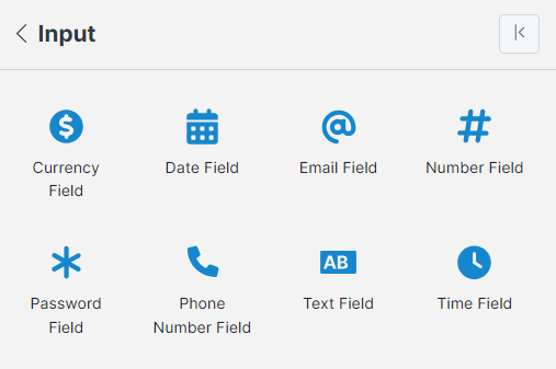
The Input block is a good example of the revised approach. The blocks menu allows you to search, select and insert a Date Field directly. This dramatically simplifies and expedites how a designer can apply different inputs within a project.
To return to the main Blocks menu, click the left chevron icon in the title area.
Blocks can be dragged and dropped directly onto the Pages panel or Form Editor view. When you drag and drop a collection block, it will provide a default sub-type which you can then change via the question’s properties. For example, dragging and dropping the Input collection block will create a Text Field question in your project.
Subtypes have also been extended to layout types making it quicker than ever to create multi-column layouts.
There is a quick Search tool built into the Blocks panel allowing you to find matches of any type – whether a new question type or placeholder.
Pages panel
Often referred to as the Tree View, the Pages panel has been enhanced in the new Design UI to provide a range of user benefits.
Multi-select
Designers can now multi-select items in the Pages panel by holding the CTRL key as they click each element to add to the selection. This can be used to quickly move (where allowed) a collection of items from one place to another with drag and drop, or to bulk delete several pages or questions at once.
When you drag a new or existing item, a new drop position indicator shows you more clearly where the item will be placed, relieving some frustrating complexities.
Search
Pages panel offers a similar Search tool to the Blocks, allowing you to quickly narrow the view to matched items that you can then jump between to make changes a lot faster.
Shortcuts
The right-click context menu has been expanded to include quick access to annotations and find dependencies as well as the usual cut/copy/paste and delete functions.
If you need more room for the pages panel, you can quickly Pin the panel which moves it out from under Blocks to its own full-height space to the right of Blocks, allowing you to see more of your project in one place.
Inspector Panel
The Inspector panel has been updated as part of the blocks concept to show the current block type name and icon right in the title area for the selected item.
If the selected item is a sub-block from a collection, both the parent and child icons are shown – including any sub-block from a collection such as a Date Field, along with a drop-down to easily change between the sub-block items.
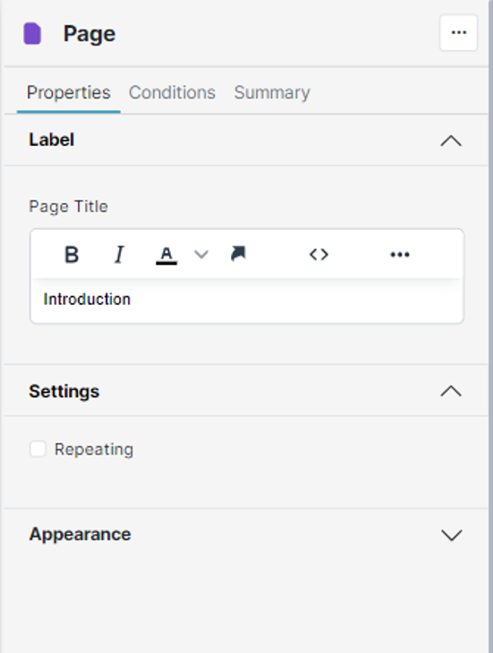
The panel has also been changed to provide top level tabs for Properties, Conditions, Validation and Summary, as well as grouping individual properties into accordions that can be expanded or collapsed.
When a referenceable element is selected, such as question or answer, the ID in the title area can be clicked to copy a valid reference to the clipboard, ready for pasting somewhere else.
Conditions
Conditions have received a major visual update, however most of the editing options remain basically intact.
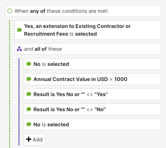
Rather than separating the condition types behind a drop-down selector, each type (Active, Visible, etc.) are always visible within the Conditions panel, which gives you an overview of set conditions much more readily.
To add conditions, you can click the + Add button and select Condition from the context menu, or simply drag blocks from the Pages panel and drop them in as the source of a new condition.
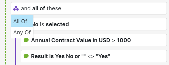
To add groups, click the + Add button and select Group from the context menu. A new group will be the opposite type than its parent, so the default child group within an ‘any of’ will be an ‘all of’ group. To change the type, simply click the group header and a context menu allows you to switch between ‘All Of’ or ‘Any Of’.
The More Options (…) menu for the topmost item allows Copy All, and paste All which replicates the old Design UI functionality, as well as a Delete All funsction. Every other item below the topmost has a More Options menu with singular options to Delete, Duplicate, Move Up or Move Down just that item.
It’s now easier than ever to move items between Active or Visible or Editable conditions by dragging and dropping elements between the accordions, allowing more control where previously you could only copy/paste all items and then had to remove unwanted ones.
Form View
The Form view also received an refresh that makes it more interactive than ever, bringing it one step closer to feeling like a rich editor experience rather than a preview.
Hidden elements such as Variable question types are now visible in the Form view, so you can easily select them even when the Pages panel is hidden.
Hover reveals useful tooltips and boundary indicators, and selection of any element uses a color-coded tint to identify layout (purple) or question (blue) selections.
Click the plus (+) indicator line to add a new element to the form directly in the view, revealing a floating panel where you can browse or search Blocks that are valid for adding inline. Click ‘Show More’ to reveal (almost) all Blocks in the floating panel.
Note: some blocks are not valid for inline add, such as those which are only valid to be added to the Finish page.
A new floating tools area in the top right of the form view provides quick access to:
- Page selector – change the current page or create a new page
- View options – enable/disable highlighting mode
- Screen size picker – choose an appropriate preview width to help lay out pages on smaller screens
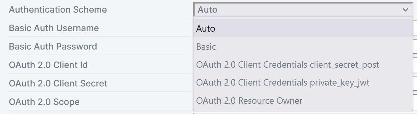
New REST Authentication Scheme Connector Settings
You can now define in manage what authentication protocol is used by specific fields in the REST connector, under the "Authentication Scheme" setting. "Auto" is the is the previous functionality that includes all the options and operates solely off of what field has a value. "OAuth2.0 Client Credentials private_key_jwt" is new and requires auth to be set to "Inherit from Settings". Read more here https://darutk.medium.com/oauth-2-0-client-authentication-4b5f929305d4
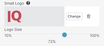
Theme Builder Small Logo
A small logo property has been added to the theme builder, that allows the logo to be scaled percentage wise from 10 - 100 %
'SmartIQ Prepare Form' Action
This new action creates a pre-populated form for a user, replacing the error prone method of using the 'SmartIQ API Action for the same purpose.
The Published Project Guid input within the action inputs is mandatory to define the project containing the data for pre-population.
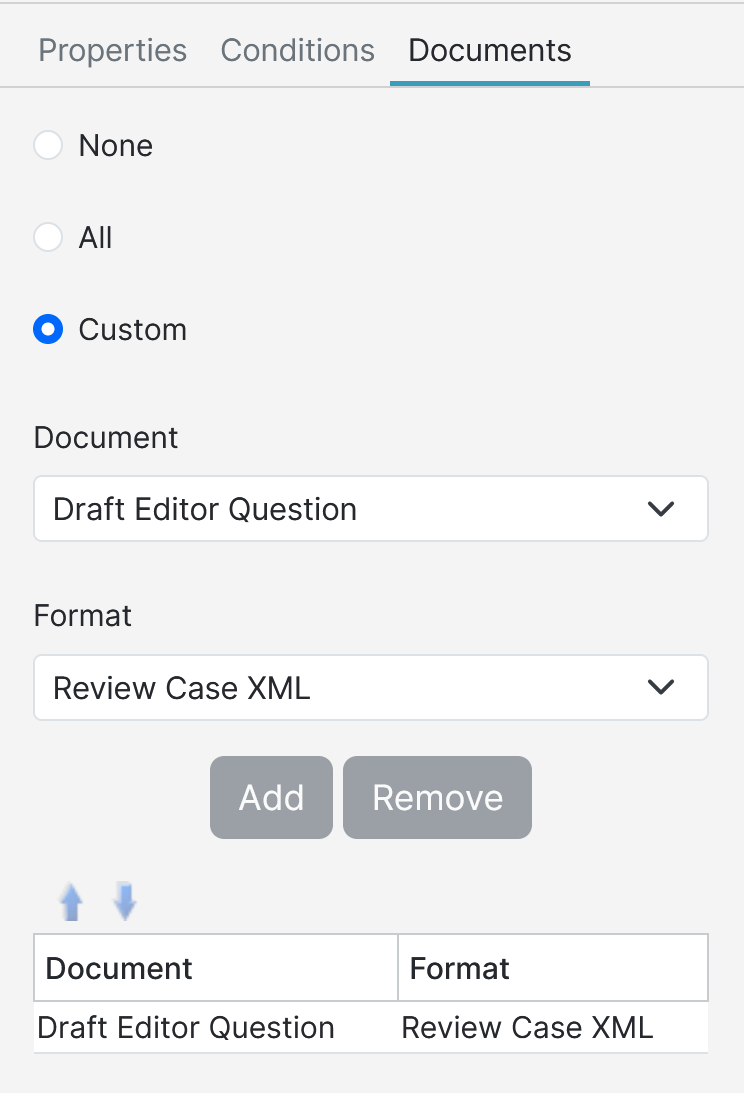
Draft Editor ReviewCaseXML
Draft Editor ReviewCaseXML is now a document format option available for use in actions when a Draft Editor question is selected as the document in said actions. The ReviewCaseXML document contains details about what is in the Draft and doesn't show up as a Downloadable document on finish.
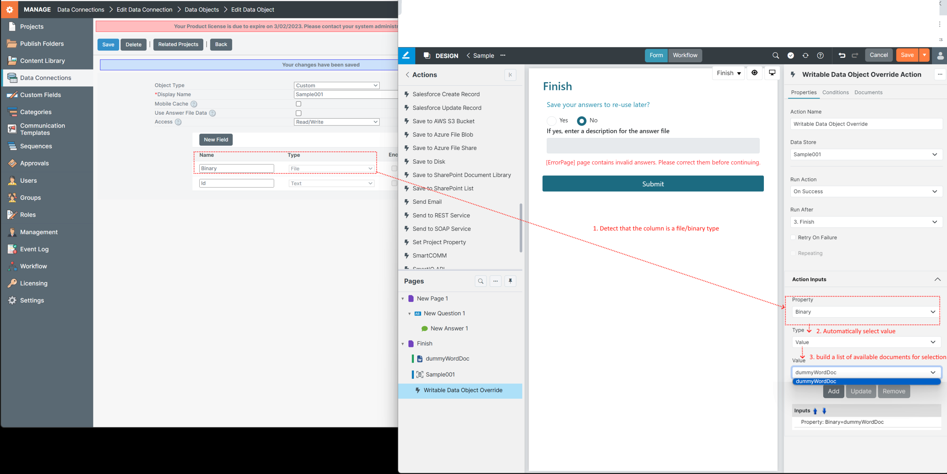
Documents as input for Writable Data Object Override Action
The writable data object override action supports files (generated documents, action document, or uploads) as action inputs. I.e. you can pass documents available after a form is submitted, such as a generated document or action output document, to a writable data object.
It works by detecting that the property to be overridden is a binary and presenting a list of documents that are available to the action. At run time the selected finalised document is passed to the writable data object.
The documents available in the drop down are those that are configured in the documents tab.
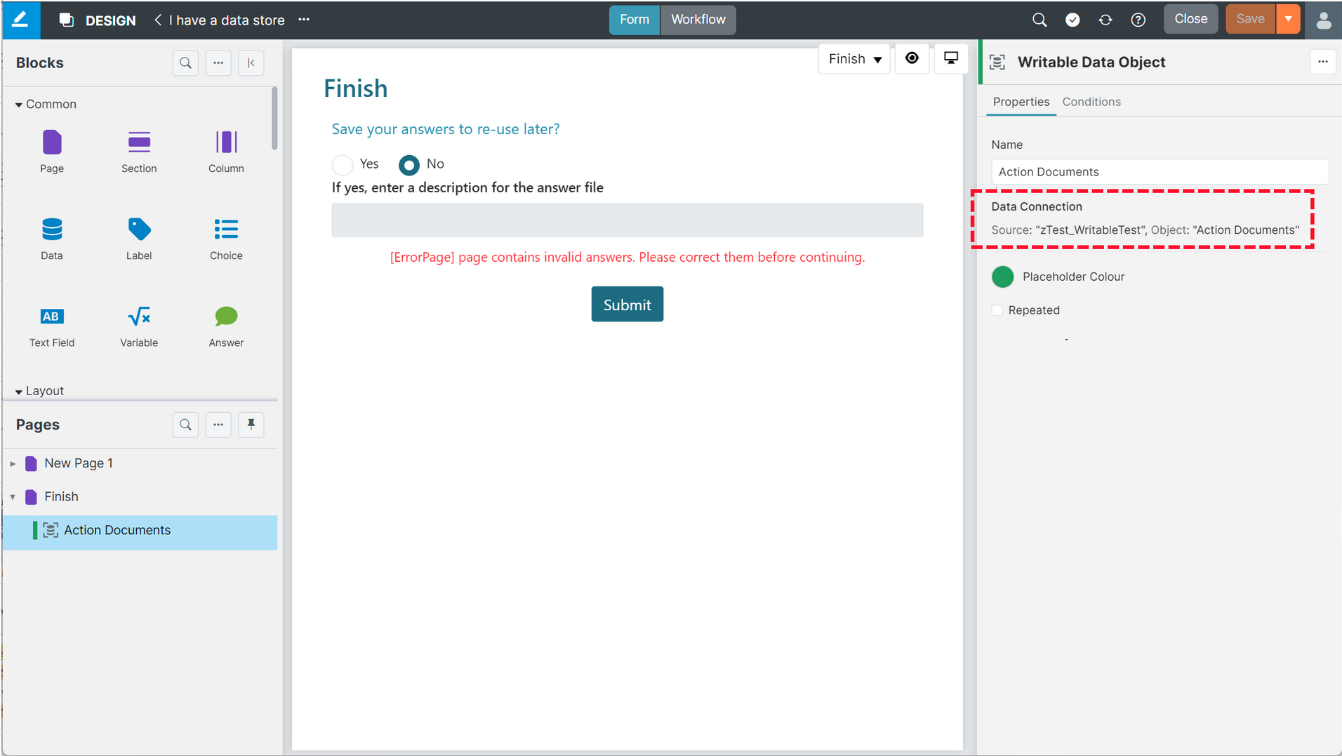
Writable Data Object Data Connection Information in Inspector Panel
The Writable Data Object question will now display the data connection source information in the inspector panel, under the properties tab.
ODBC
ODBC is no longer supported in AWS and CoLo.
MTLS support for REST
An 'mTLS' setting in manage has been added for REST Endpoints Requiring MTLS authentication, that includes a client certificate in the request. The mTLS client certificate is managed on a one certificate per environment basis; only the APAC server environments have an mTLS certificate installed.
Updated 5 months ago