
Theme Builder
This is the recommended way to change the look and feel of your projects
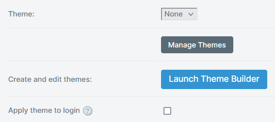
Theme Builder allows you to create and manage themes that reflect your brand's look and feel in SmartIQ Produce. Theme builder is found within the Manage Settings, along with the option to set a global default theme. This theme will also be used for any published project that do not have a specific theme applied; see Publish Folders.
Themes are created as independent objects which be configured to operate at the Site level or the Published Project level. These are also the two places that the Theme Builder application can be launched.
Themes allow you to control a range of visual elements from logos and colors to typography and styling. With the ability to create any number of themes, you can set one global theme for Produce, and then set different themes for specific published projects, even re-use a theme for multiple projects.
Theme Builder lets you see your changes as you go with a live preview built into the interface, making it easy to create your brand and instantly see it in context.
Theme Builder Permissions
Users must have appropriate permissions to access Theme Builder.
Theme Builder Permissions
System administrators can apply restrictions so that only specific roles have creating and editing privileges.
| Tasks | Permissions |
|---|---|
| Launch Theme Builder, Create and edit themes in Theme Builder |
|
| Set the current default theme for Produce (site level) |
|
| Set the current theme for a published project |
|
Note
If you have permission to access Theme Builder you can create and edit any themes in Theme Builder regardless of whether a theme is used for the whole site or published at a project level.
Theme Builder Overview

Preview
The preview area provides a live view of how your theme looks in context. Use the view selector or view example links in the properties panel to select what context the preview is showing.
You can change which theme is being previewed by selecting the theme in the properties panel. When no theme is available, the preview simply shows how things look by default without a theme.
View Selector
Use the view selector panel to change the preview content and resolution.
Available views include:
- Home - this is an example of the Produce home page.
- Sample Form - this is an example of a form in Produce with a range of controls in a typical layout.
- Component - this is a list of various components arranged by category to easily find examples based on any of the adjustable attributes in your theme.
- Login - this is an example of the Login page.
Properties Panel
The properties panel is the main interface for making changes to your theme.
All interactions to create, modify and even delete themes are available in the properties panel, which provides drill-down navigation to progressively reveal more detail.
For more information on using properties panel to create, modify or delete a theme, refer to the relevant sections in this guide.
Resizing the Properties Panel
The properties panel can be made bigger or smaller when you drag the left edge of the properties panel, which will in impact the available space for the preview area. This can be useful for providing more room for your properties or conversely to see a bit more of the preview area.
Login Page
Theme Builder can be used to style the login page using your brand’s primary color and logo. You can override the default login page logo, and set a solid color or image to use as the background. This enables dynamically rendering a new, on brand login experience on the various login, reset and access code screens used for unauthenticated users.
In Theme Builder, while modifying a theme, you can navigate around the various categories and make any changes you like, even see a live preview of those changes, all without saving the changes. Only once changes are saved can users see them take effect in Produce.
Modifying a Theme
- In the Theme Builder properties panel, select the theme you wish to modify. This will refresh the preview and enable the edit button.

-
Click the edit button.
-
Change the components and styling elements in the properties panel.
In Theme Builder, while modifying a theme, you can navigate around the various categories and make any changes you like, even see a live preview of those changes, all without saving the changes. Only once changes are saved can users see them take effect in Produce.
- Click Save.
Deleting a Theme
- In the Theme Builder properties panel, click the delete button (trash icon) for the theme you wish to delete.
The Theme Deletion confirmation displays.

- Click Delete Theme.
Your theme is now deleted and removed from Theme Builder. If it was in use at the site or published project level, these references will be removed.
Migrating Themes (Import/Export)
Themes can be migrated from one environment to another, for example from preview into a production environment. However, exported theme files will only be compatible for import in another SmartIQ system of the same version.
Project Export
Exporting a project or sync package will not include themes. Theme files will have to be exported/imported separately.
Export/Import Themes from the [Manage interface or an [Admin API.
From the Manage Interface
Export theme package will create an <name>.iqtheme file, with a JSON file that provides the theme information.

Importing an .iqtheme file presents the project name with optional import overrides.

Use the Admin API
This is done via the admin API, either by writing code or using a third-party tool such as Postman.
Using the Themes API you can:
- Retrieve a list of themes, including each theme ID
- Export a theme by ID as JSON data
- Import a theme from JSON data
For themes that are applied at a published project level, you can also export them with the published project as part of a Sync Pack.
Designing Themes
Themes provide a set of attributes you can configure to change the look and feel of SmartIQ Produce to suit your brand. Theme attributes are grouped into high level design categories which provide an easy way to navigate and modify your themes.
In Theme Builder, while modifying a theme, you can navigate around the various categories and make any changes you like, even see a live preview of those changes, all without saving the changes. Only once changes are saved can users see them take effect in Produce. Alternatively, you can cancel the changes to keep the theme as it was when last saved.

This page describes each of the design categories in more detail.
Color Pickers
Click the sample color circle beside any color to show a pop-up color picker. Use the sliders to choose hue, saturation and brightness to find a suitable color, or type a valid hexadecimal color value. The color picker also provides color swatches across the top, allowing you to quickly re-use a color previously set within the theme.
Properties
| Attribute | Description |
|---|---|
| Theme Name | Modify your theme's name. This value must not be empty, and cannot be the same as any other theme. Maximum of 50 characters. |
Brand
Colors
| Attribute | Description |
|---|---|
| Brand Primary | Applied to the most visually prominent components, primary color is used on main titles, primary buttons, check boxes and radio controls. It's also used to accent various elements including tabs, page navigation and the wait animation. |
| Brand Secondary | Used on secondary buttons, toggles, accordion tabs and publish folders. |
| Contrast Options (Primary and Secondary) | Default contrast colors automatically reflect the default calculated contrast colors as the base primary and secondary brand colors change. However, the option to override is provided by expanding Contrast Options and selecting a color from the provided color pickers. Note: The selected contrast color will remain even if the primary and secondary brand colors change. |
| Header Background | The background color of the main header shown on Produce home, form pages and dashboards. |
| Header Text | Used for text on the header including the form title. The text color should contrast with the header background for readability. |
| Header Link | Used for links on the header. The link color should contrast with the header background for readability. |
| Header Link Hover | Used for links in the hover state. The hover color should contrast with the header background for readability, and is often set to a slightly lighter or darker shade of the link color. |
Logos
| Attribute | Description |
|---|---|
| Site Logo | Defines a logo to show in the header on full screen devices. Recommended maximum pixel dimensions is 385 (width) x 100 (height). Supported image formats are BMP, JPEG, GIF, SVG, and PNG. |
| Logo Size | Provides a slide control to adjust the size of the main logo for use in the header. - For raster files (BMP, JPG, GIF and PNG), the slider allows the size to be reduced only to avoid significant upscaling. If a larger logo is required, upload a larger image file and then resize down to suit. - For SVG files, the slider defaults to the middle 50% position and allows adjustment up or down in size. |
| Small Logo | Defines a smaller logo to show in the header on mobile/small screen devices. Recommended pixel dimensions are 60 x 60. Supported image formats are BMP, JPEG, GIF, SVG, and PNG. |
| Favicon | A very small logo used in the browser for tab and bookmarks, depending on browser support. Recommended pixel dimensions are 16 x 16. Supported image formats are PNG, ICO and SVG. |
Logo Scaling
When you select a site logo, if you don't already have a small logo, it will default to the same as the site logo and apply down scaling. Equally, if you select a small logo before choosing a site logo, the site logo will be an upscaled version of the small logo. To change either case, simply override the logo applied.
Scaling of images, especially upscaling, can create poor quality results.
Style
| Attribute | Description |
|---|---|
| Shape - Corner style | Sets the corner style for all buttons and inputs. Options are: - Square - Normal (default) - Rounded - If selected, provides the option to exclude rounding the corners of Input Fields. |
| Depth - Button elevation | Sets whether shadow is used to create an elevated effect on buttons. Note that only primary and secondary buttons are affected. Options are: - Flat - (default) no shadow effect - Raised - shadow effect |
| Content Width | Sets the ability to control the width of the form content, which changes the left/right margin padding sizes. - Wide (default) - (formerly Constrained) Adds left/right margin spaces for larger displays, scaled based on screen resolution - Narrow - Provides a similar constrained appearance to 'Wide' but with more constraints on larger screens to keep content looking narrower - Full - Removes all padding and pushes the content to 100% of the available space (except for the home screen) - Shadow - Provides the option to add a shadow that creates an elevated effect for the content area. Only available if Wide or Narrow are selected.Note: On smaller screens with less horizontal resolution, content is always set to 100% of available space regardless of the Content Width setting chosen. |
| Content Area – Fill type | Provides the ability to set a color or background image to display behind the content area. Only available if Wide or Narrow are selected. |
Typography
Fonts
| Attribute | Description |
|---|---|
| Font Stack | Select the preferred font stack from the drop-down list. Options are: - Sans Serif - (default) uses the system defined preferred sans serif font. - Serif - uses the system defined preferred serif font. - Monospace - uses the system defined preferred monospace font. - Classic - retains the same font stack from previous versions of SmartIQ. |
Click Show output to reveal the underlying font-family CSS that will be used in the style for the chosen font stack.
Custom fonts can be added via the Content Library if additional fonts are required.
Colors
| Attribute | Description |
|---|---|
| Page Title | Page title appears on the top of every form page. |
| Question Text | Question text color including the various position options of top, left or floating. |
| Body Text | Defines the color of input text and labels, as well as any other text not associated with another text style. |
| Link Text | Anchor link text color includes project links on the home page, link buttons (such as save), and any anchors in labels. |
| Link Hover | Provides a hover color for anchor links. |
Weight
| Attribute | Description |
|---|---|
| Heading Weights | Select how light or heavy to make headings appear, including page, section and column titles. Options are: - Light - Normal (default) - Semi-bold - Bold |
Not all heading weights are supported by all fonts in all font stacks, and so results can vary from system to system. Most modern systems will support a variety of font weights when using the Sans Serif font stack.
| Attribute | Description |
|---|---|
| Global Scale | Select the relative size of all fonts. Options are: - Small (90%) - Medium (100%) - Large (110%) |
Notifications
Messaging Colors
| Attribute | Description |
|---|---|
| Error | Sets the color used for validation or other errors that may be displayed in the page navigation, input field or finish page. |
| Warning | Color for warning labels and messages. |
| Success | Color for success labels and messages such as form submitted toast messages. |
Help Text
Styling of the help text boxes used at the question level. Select from a light (default) or dark option to reflect the overall aesthetic of a theme.

Components
The Components menu provides advanced options to override components like Buttons and Headers.
Buttons
| Attribute | Description |
|---|---|
| Primary and Outline | Provides advanced options to override the default values for primary and outline buttons. Options are: - Filled Text Label - Outline Text Label - Background Hover |
| Toggle | Provides advanced options to override the default values for toggle buttons. Options are: - Unselected Text Label - Background Hover |
| Link | Provides advanced options to override the default values for link buttons (such as the Save link button). Options are: - Text Label - Text Label Hover |
Header and Navigation
| Attribute | Description |
|---|---|
| Header Border | Provides advanced options to override the default values for Header borders. Options are: - None (default) - Primary - Secondary - ShadowNote: You can select Fixed Header to keep the header and navigation area fixed in place, while the main form question area is scrollable. |
| Navigation Style | Provides advanced options to override the default values for the navigation styles and provides a bolder look that works well for some themes. Options are: - Default - Primary Filled - Secondary Filled |
| Navigation Colours | Panel background - sets the background color for the whole sidebar panel - default white Content background - sets the background for pages list, help text and answer files content blocks within the sidebar panel - default white Text - sets the text color for the pages list, help text and answer files content blocks - default body text (on change of content background calculate new contrast unless this is overridden) |
Login Page
Theme Builder can be used to style the login page using your brand’s primary color and logo. You can override the default login page logo, as well as setting a solid color or image to use as the background of the login page. This enables dynamically rendering a new, on brand login experience on the various login, reset and access code screens used for unauthenticated users.
If the logo is left blank, Theme Builder will use the Brand Logo by default.
Enabling the Apply theme to login option will apply the selected site theme to the following:
- Login page
- Forgot password page
- Send request page
- Reset password page
- Temporary user access page
- End User License Agreement (EULA) page
If a direct project URL is used, for example, when a direct link is emailed as part of a workflow, and there is a theme set for that published project, the login page will show the published project theme instead of the site level theme.
Using the themed login pages provides a branded experience based on the primary color and featuring the main header logo and background color, as well as various other theme colors.

Login Page and Custom CSS
Enabling the Apply theme to login option will prevent any custom CSS from loading during login, and so will not be able to apply custom CSS to any login pages. If this is required, do not enable this option.
Updated 2 months ago