
Choice
A choice question is a question type where the user is asked to choose one or more items from a limited list of options. This is useful for simple click interaction to select either exclusively one of a set of options or multiple in that set, while allowing the user to see what is selected and change selections if desired.
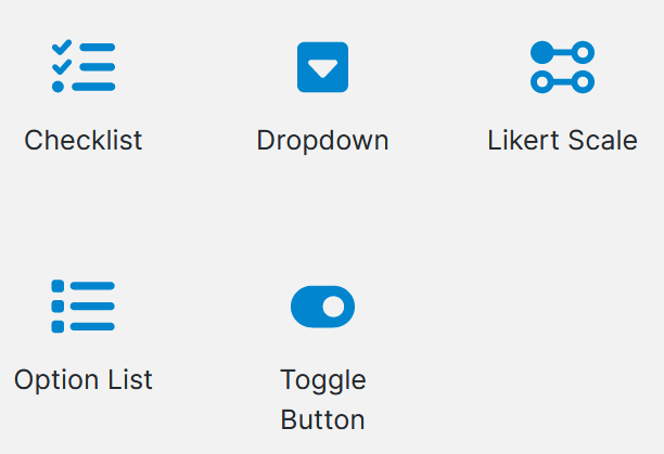
There are multiple types of Choice Question that each have their own available property options.
Usage
If logic, based off of previous parts of the form and/or defaults, is used then these can streamline form filling by preselecting and displaying these selections to users.
Add the question, that fits your use-case, into the desired location in the project or Pages Panel. A popup will appear and ask you to input the multiple choice values (you don't have to fill in all the options). To add more select able answers simply add an Answer Question to the Choice Question.
Properties
| Property | Available Type | Description |
|---|---|---|
| Question Text | All | The text to display in Produce for the set of multiple choice answers |
| Text Position | All | The options are: Top, Left, (None) |
| Mandatory | All | Checking this box will make the question mandatory. This is unchecked by default. |
| Selection Type | Toggle Button can do both | Determines how many selections a user can make |
| Single Answer | Option List, Dropdown List, Likert Scale | Users can only select one answer |
| Multiple Answer | Checklist | Users can select multiple answers |
| Display Direction | Option List, Checklist | Choose from: Vertical Horizontal 2 Column 3 Column 4 Column |
| Grouping Id | Option List | Specify an id to group several multiple choice questions with single selections together. This enables adding dependent questions directly below the selected answer. |
| Help Text | All | This allows you to create text explaining what information is requested in the question. |
| Comments | All | Checking this box allows comments to be added. This box is unchecked by default. |
| Style | All | This allows you to change the background style of the answers to one of the following options: Alert (Error) Alert (Info) Alert (Success) Alert (Warning) Jumbotron Label (Default) Label (Error) Label (Info) Label (Primary) Label (Success) Label (Warning) Well |
| Width | Dropdown | Set a width for the drop-down box |
Updated 5 months ago